
Concierge
A bright identity and playful language for a neighbourhood café, carried through packaging, print and photography.
Brand Strategy Visual identity Verbal identity Packaging design Photography
concierge
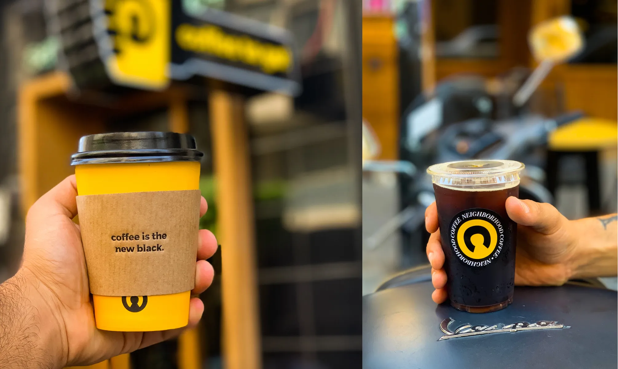
The inverted C gives Concierge a simple, recognisable mark, with yellow bringing warmth to the black and white palette. Short, playful lines carry the café’s voice into everyday objects, including a cup sleeve that reads “coffee is the new black.”
Paragraph
Video file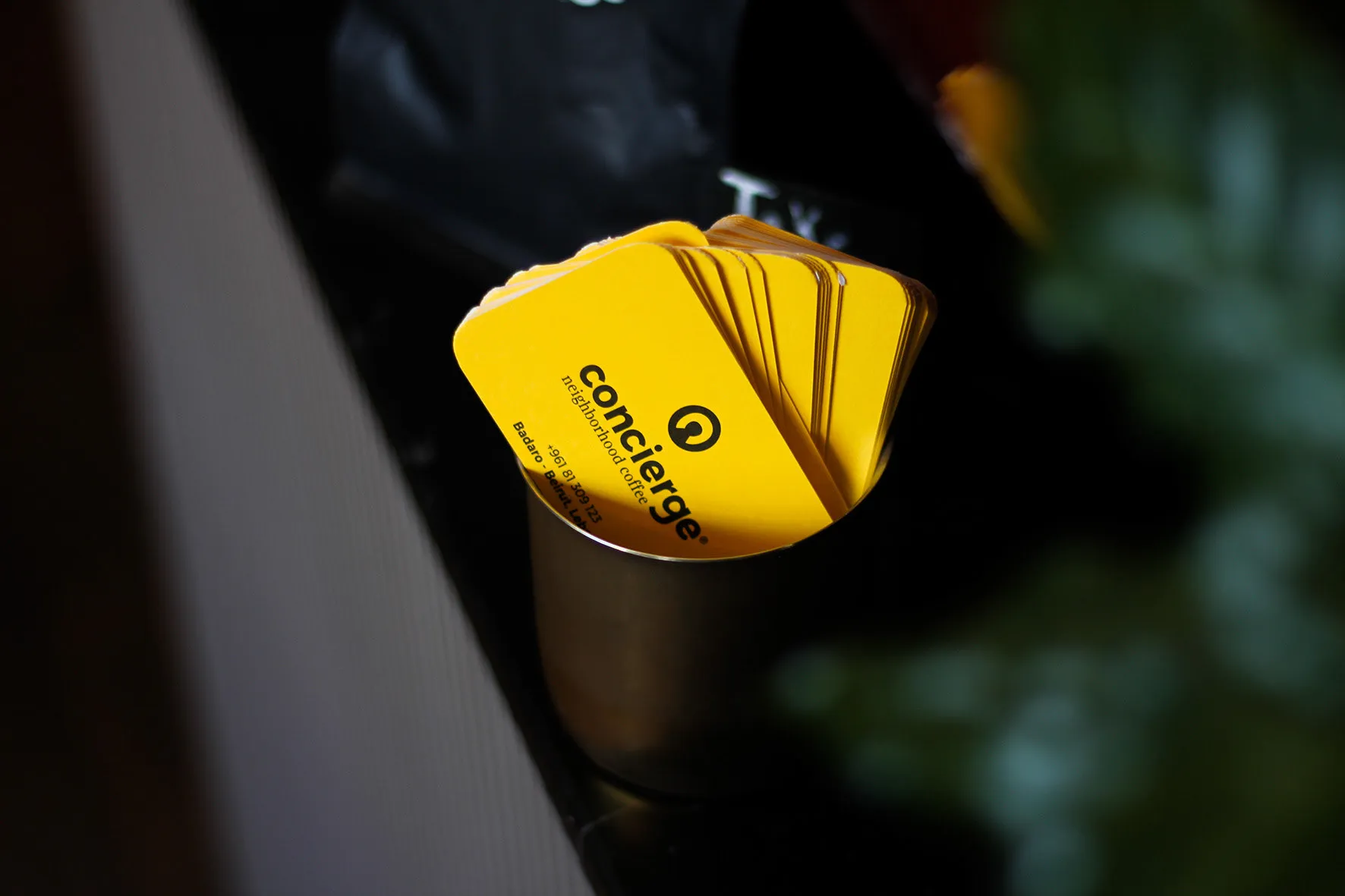
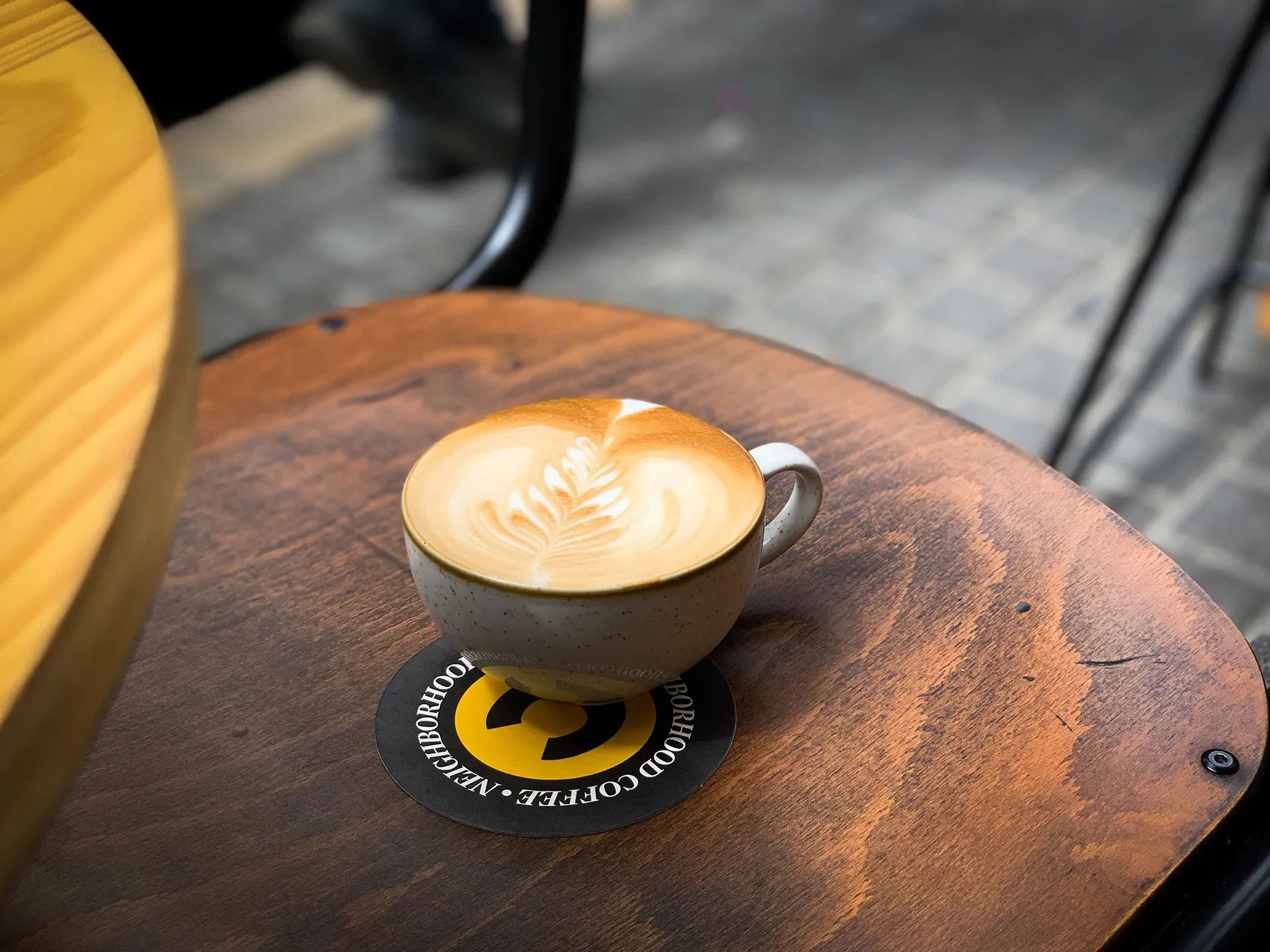
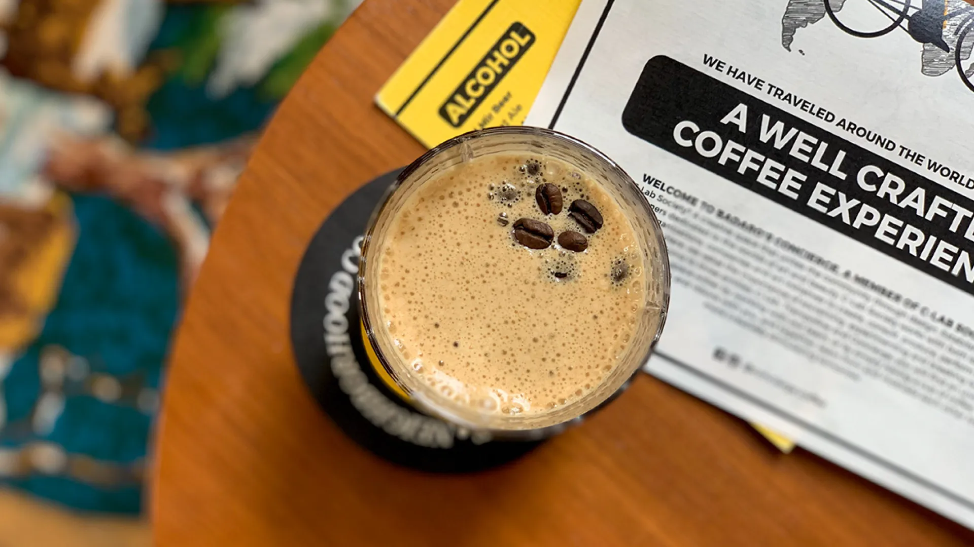
The coffee bags pair prominent origin names with tasting notes and brewing information. White, yellow and dark labels distinguish the coffees within a shared layout. The same identity continues across takeaway cups, coasters and menus, connecting the packaging with the café table.
Paragraph
Video file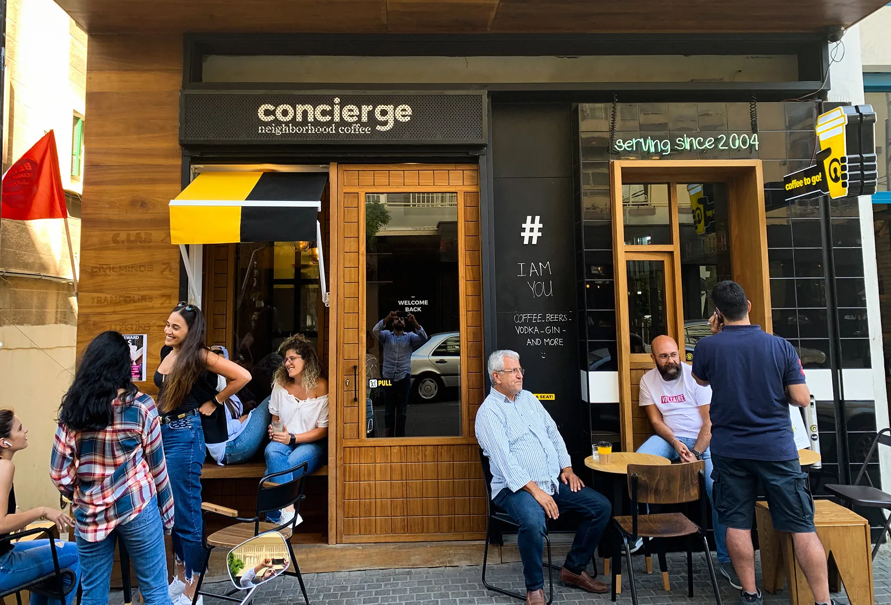


For Concierge Coffee, the neighbourhood was central to the story. The café brought coffee and concierge services together, giving residents and visitors a place to meet and spend time. We developed a visual and verbal identity that reflects that open, sociable character.
An inverted C doubles as a lock icon, a nod to the café’s concierge service. It sits at the centre of the identity, paired with a yellow, black and white palette. Playful coffee language adds personality to the practical details, from cup sleeves to labels that explain the coffee’s origin, flavour and brewing methods.
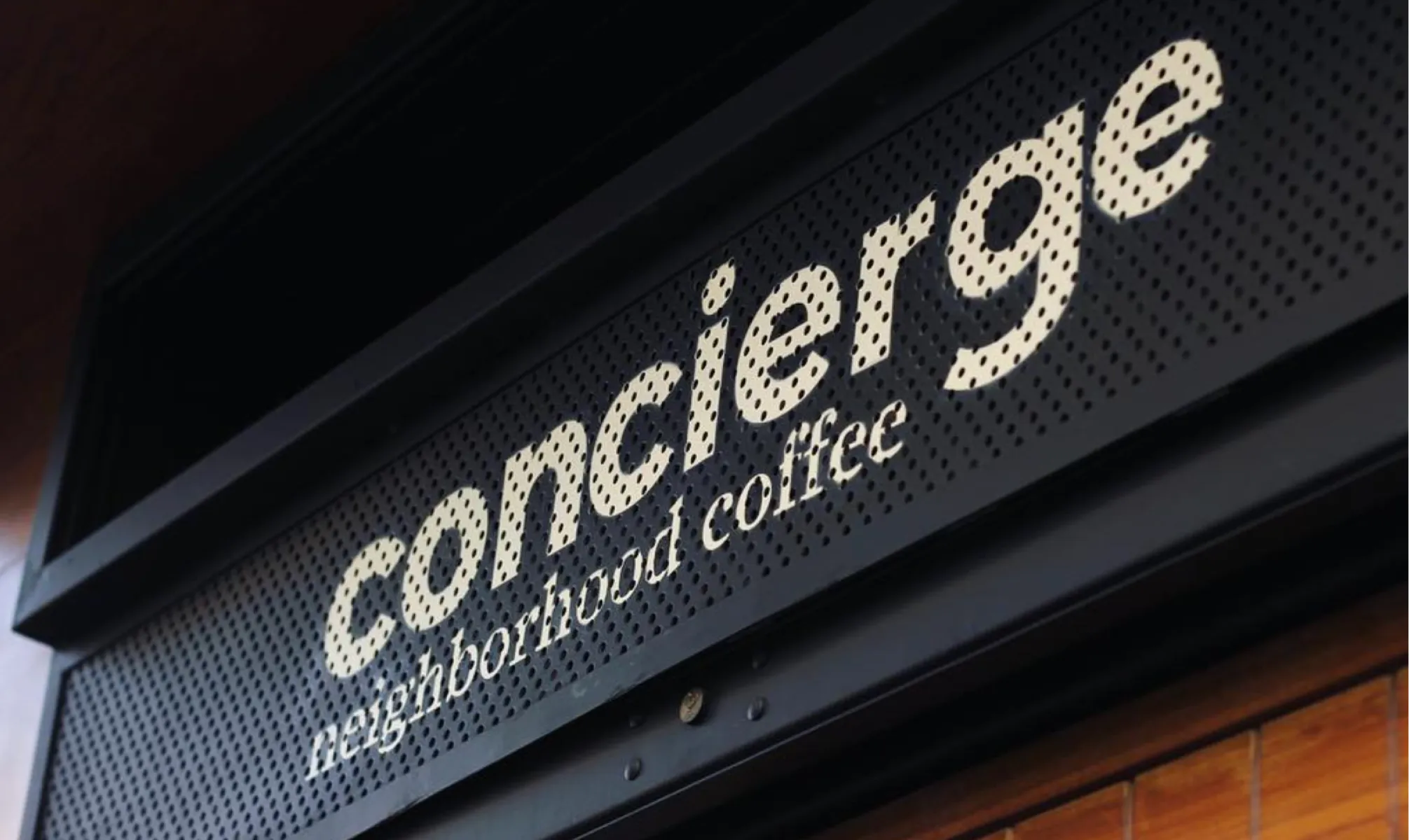
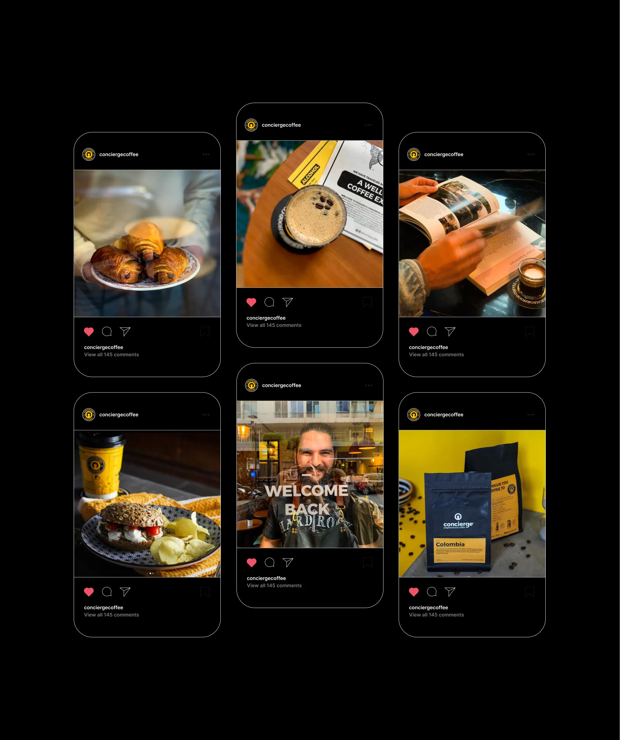
The identity carries through coffee bags, takeaway cups, coasters, menus and signage. Photography shows these elements in use: coffee on a table, a takeaway on the street and people gathered outside the café. The work connects the brand’s graphic language with the everyday life of the place.
Two Suns

Brand Strategy Art Direction Verbal Identity Visual Identity Packaging Web Design & Development
two-suns
Next video