
Serge Biokian
A geometric identity for an interior architect, shaped around the spaces he designs.
Brand strategy Visual identity
sergebiokian
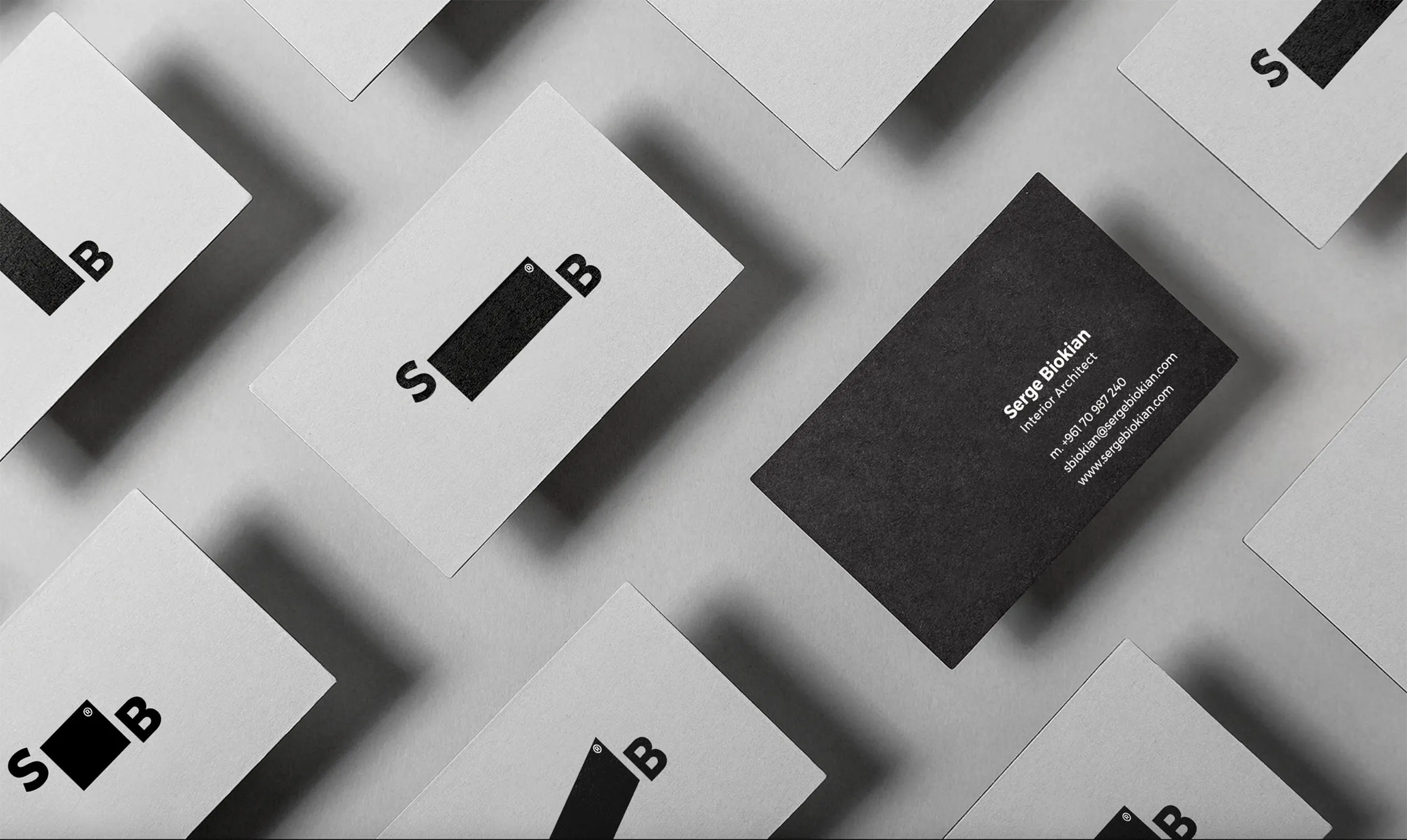
The space between S and B changes shape. A square, tall and wide rectangles, and a slanted form create four related marks, connecting the architect’s initials to his work with space and proportion.
Paragraph
Video file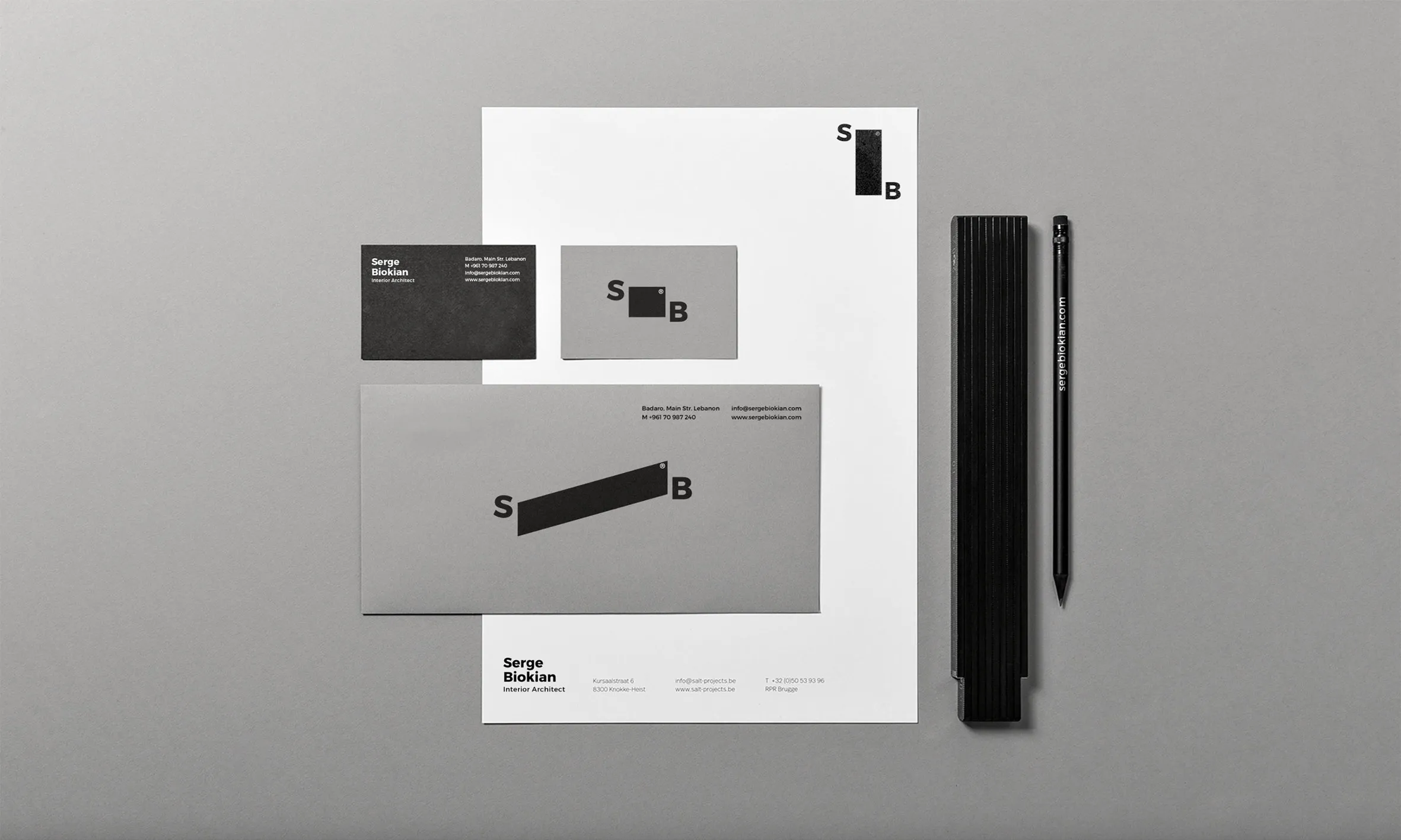
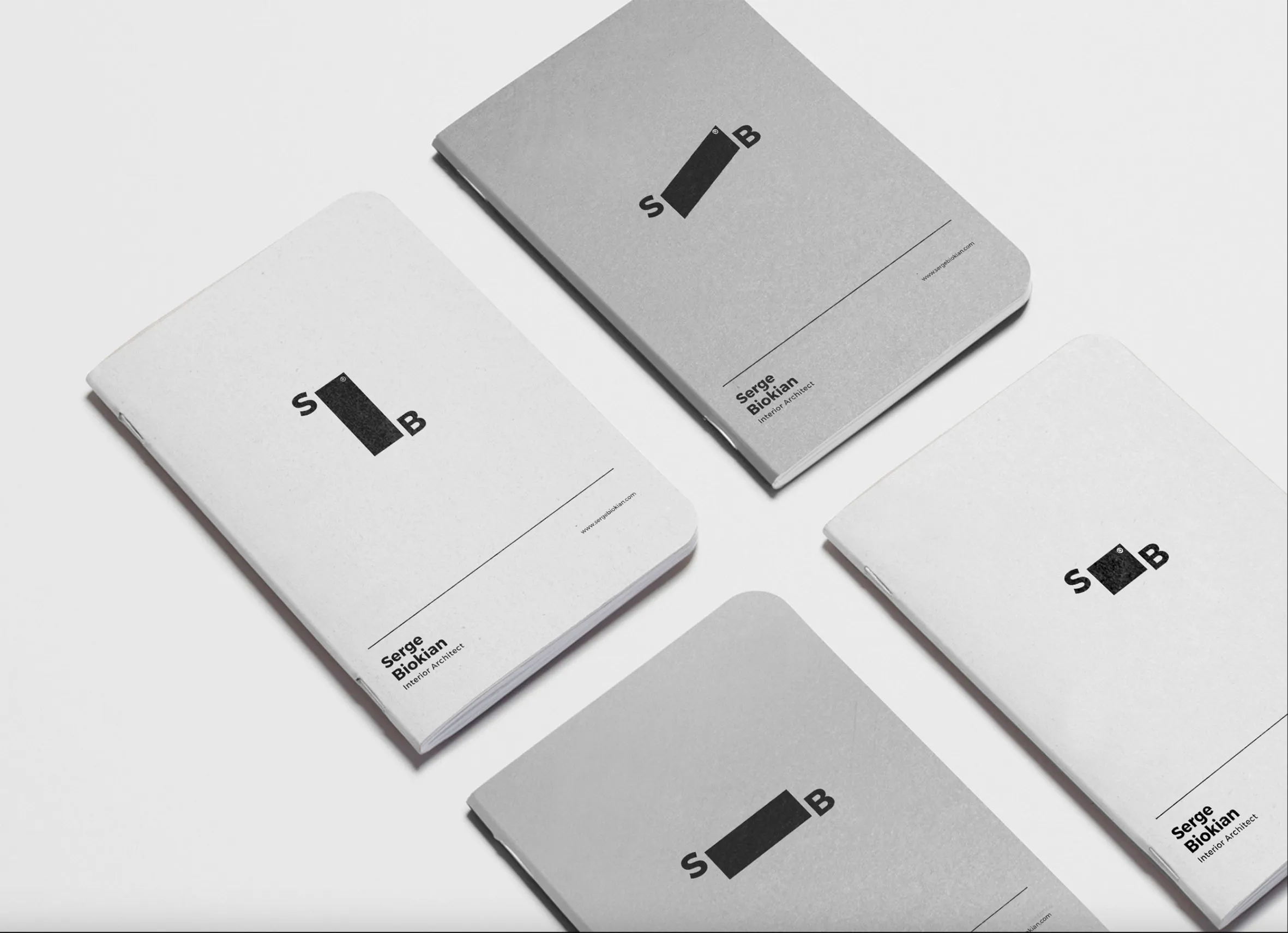
Business cards, letterheads, envelopes and notebooks carry different versions of the mark. Simple typography and generous space give the geometric forms room, while the restrained palette keeps the pieces connected.
Paragraph
Video file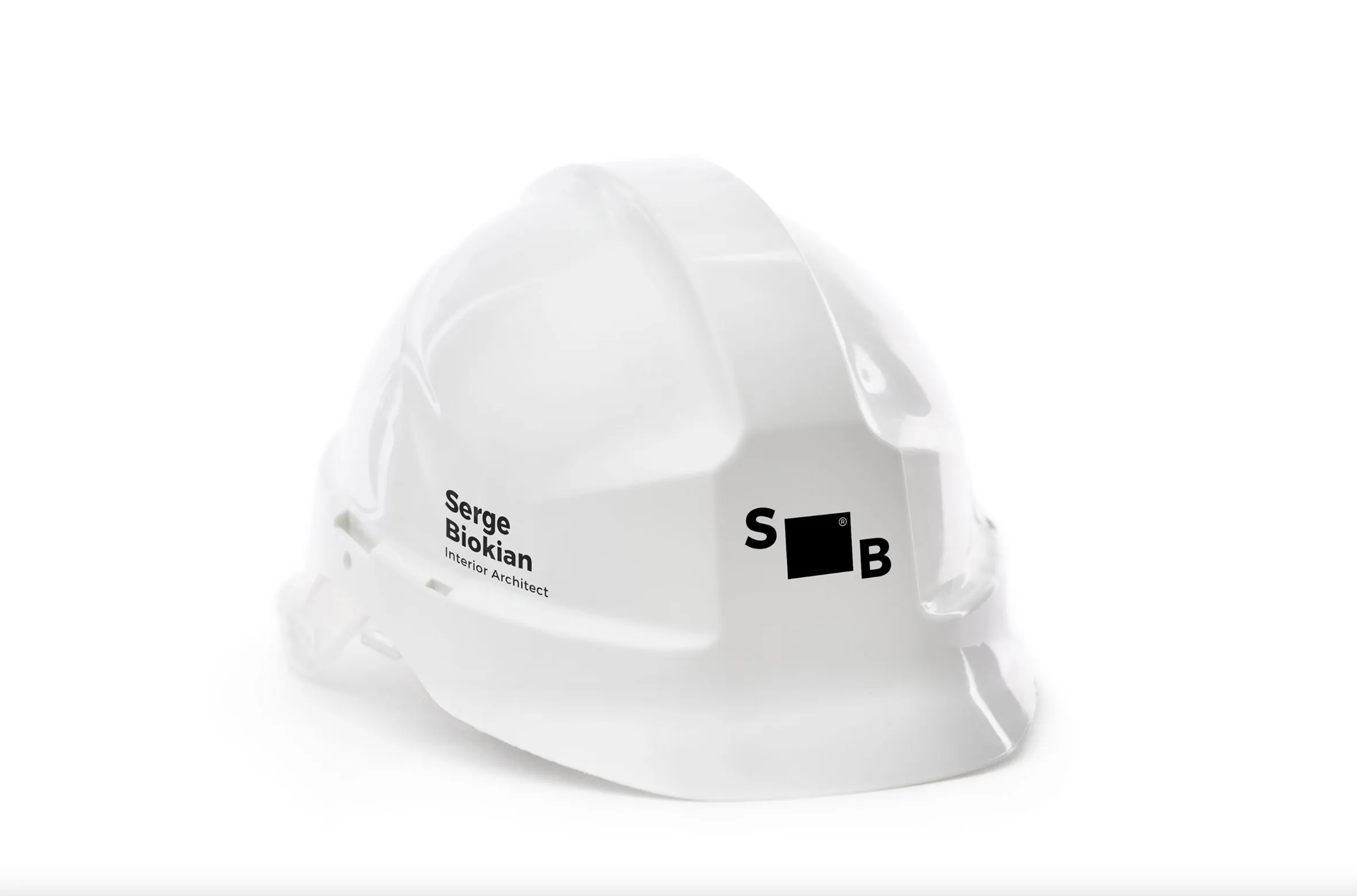
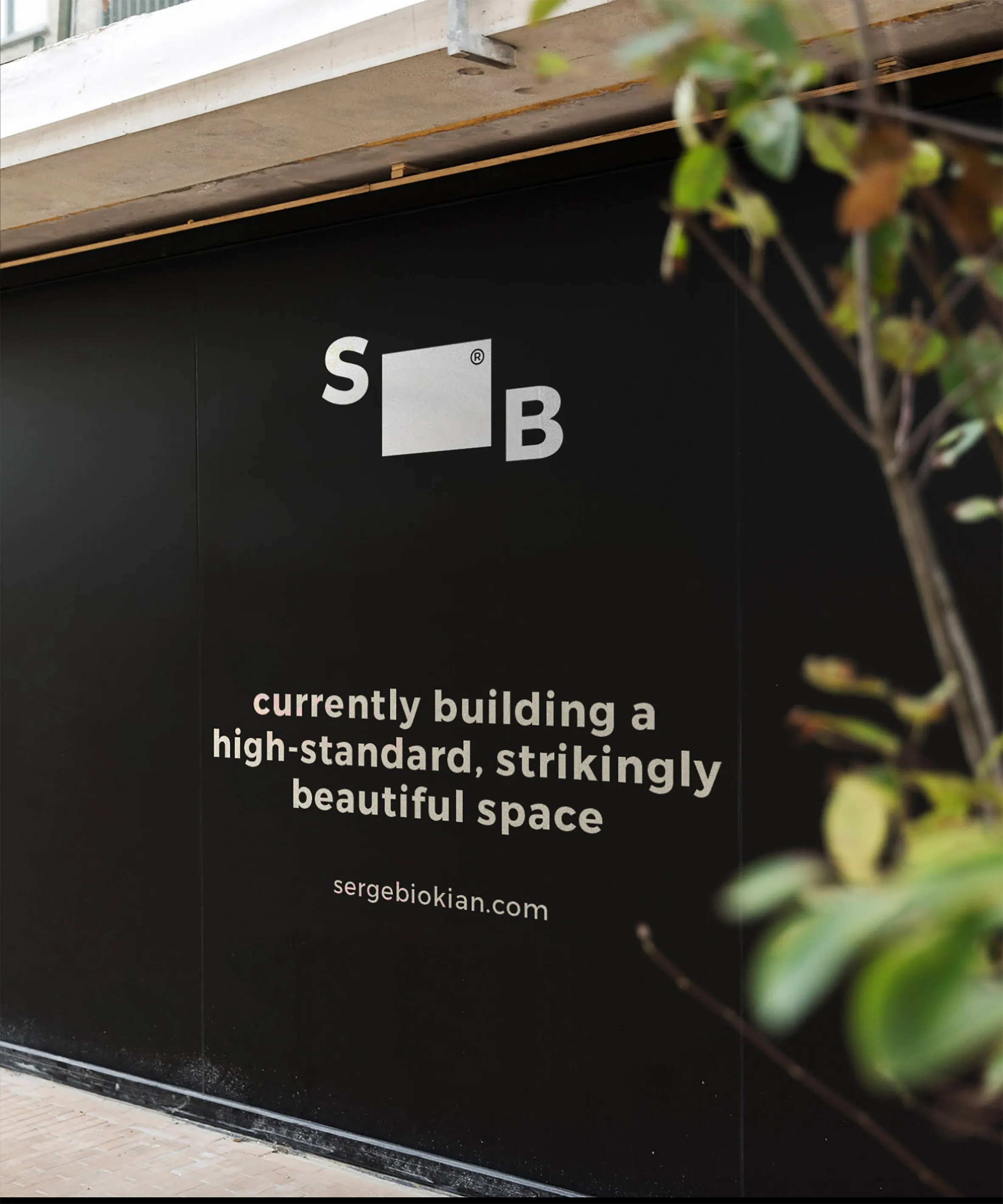
The identity extends onto a hard hat, vehicle graphics and site signage. The same initials and geometric forms connect these applications with the stationery, carrying the practice’s identity from the desk to the site.
Paragraph
Video file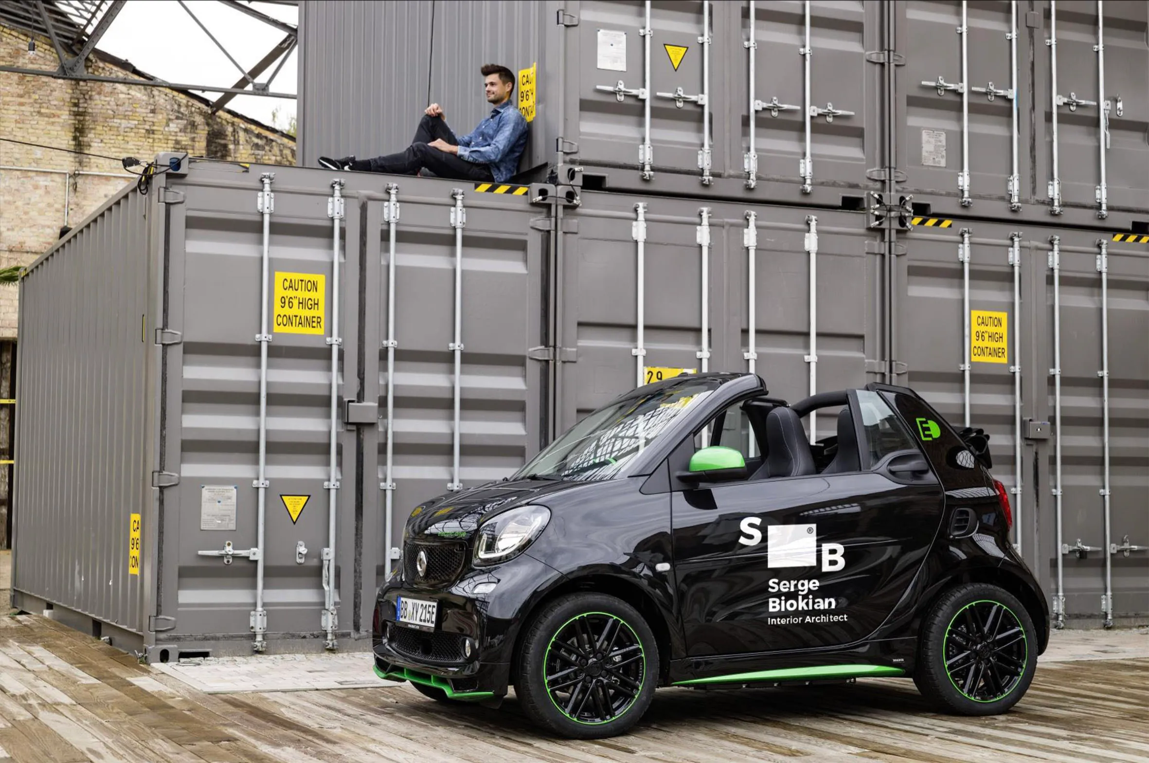
Serge Biokian is an interior architect with a modern, minimal approach to space. We developed a visual identity that reflects that approach through form, proportion and a restrained palette.
His initials sit on either side of a geometric shape that changes across four versions. Each refers to the different spaces he designs, while the S and B hold the system together. Black and white and straightforward typography keep the focus on those changing forms. The identity carries across stationery, signage and site materials, giving the practice a consistent presence in different settings.
Concierge
Brand Strategy Visual identity Verbal identity Packaging design Photography
concierge
Next video