
syp
A new name, identity and packaging system for a UAE wellness brand growing beyond its plant-based roots.
Brand Strategy Visual Identity Verbal Identity Packaging Digital Assets Naming
syp


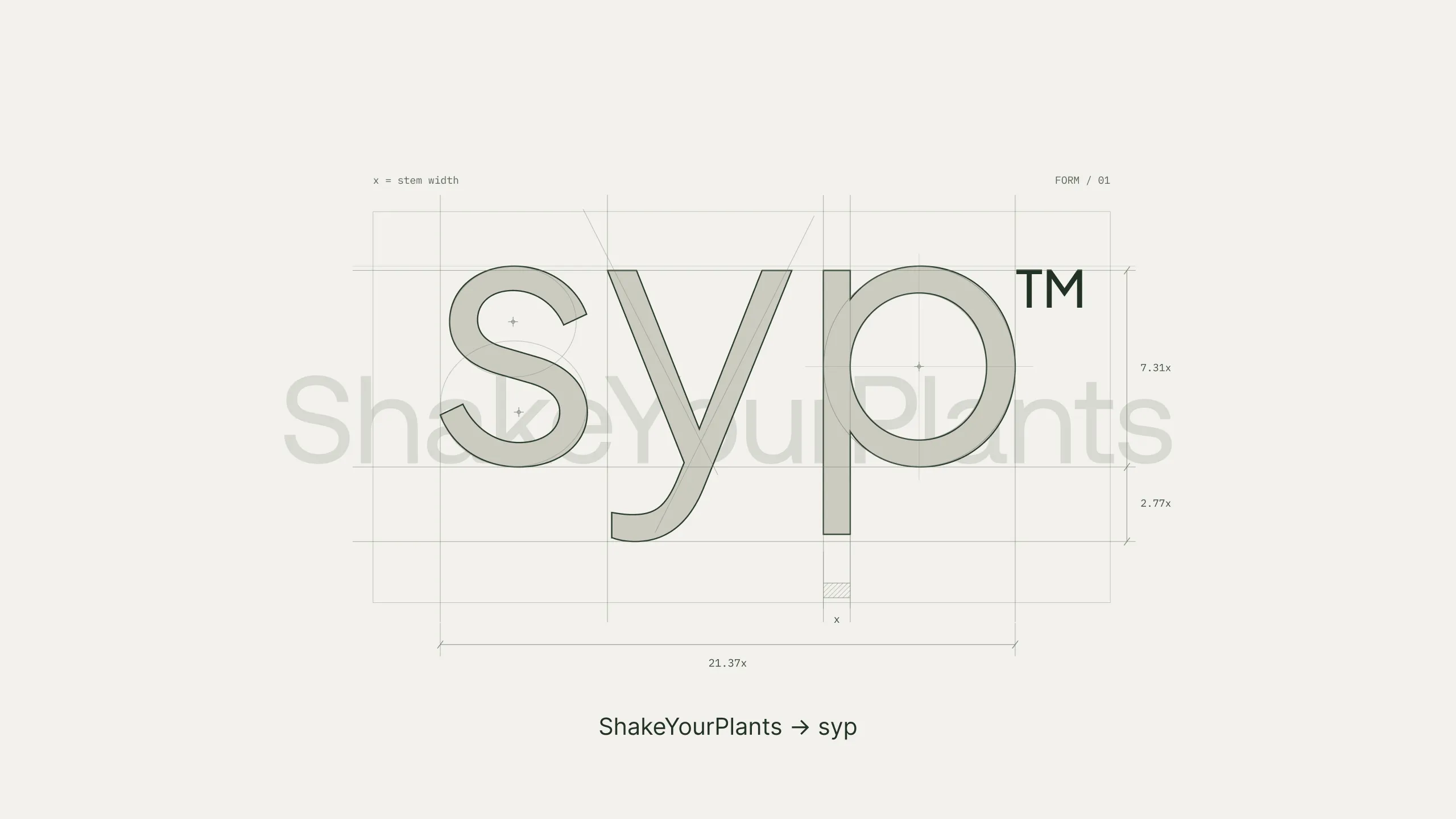
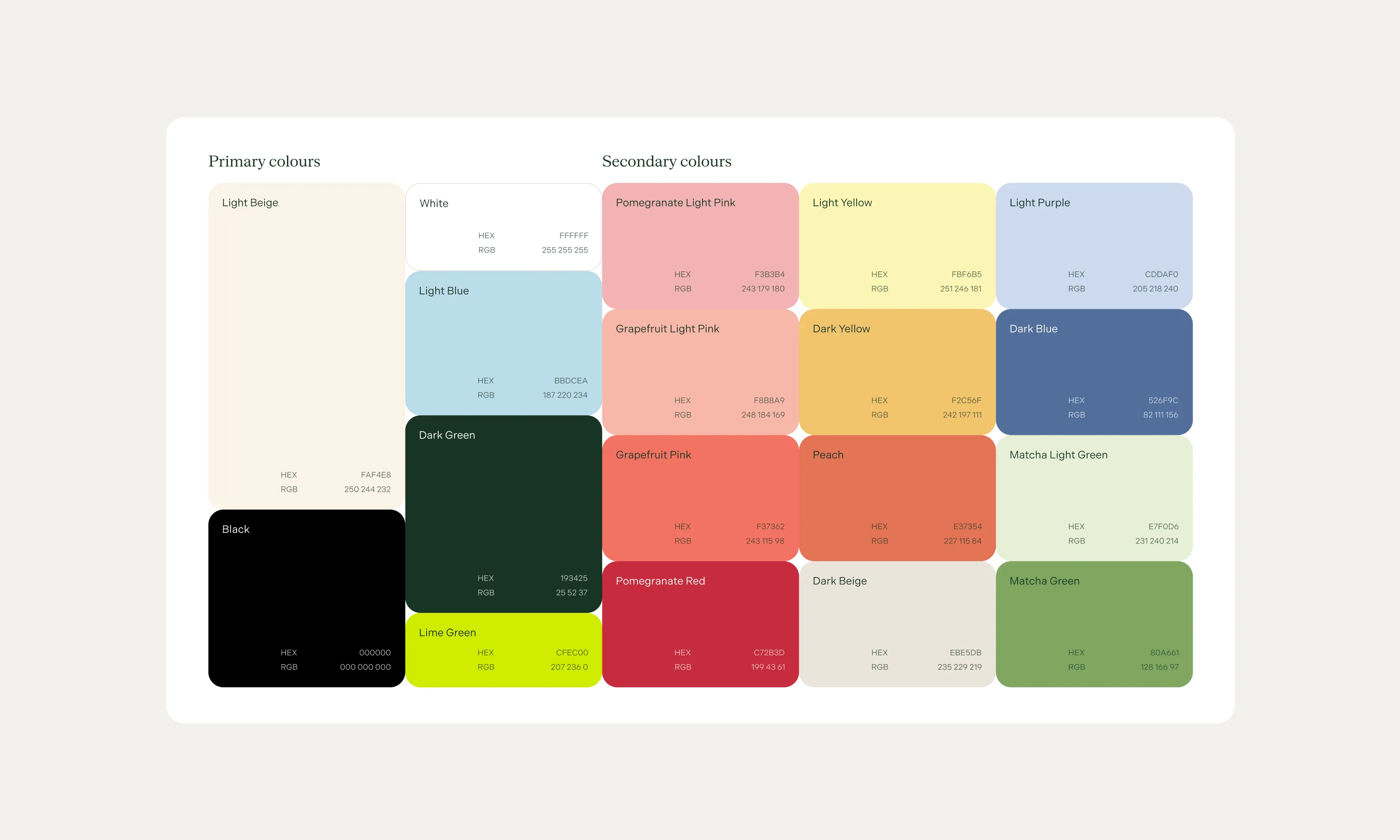
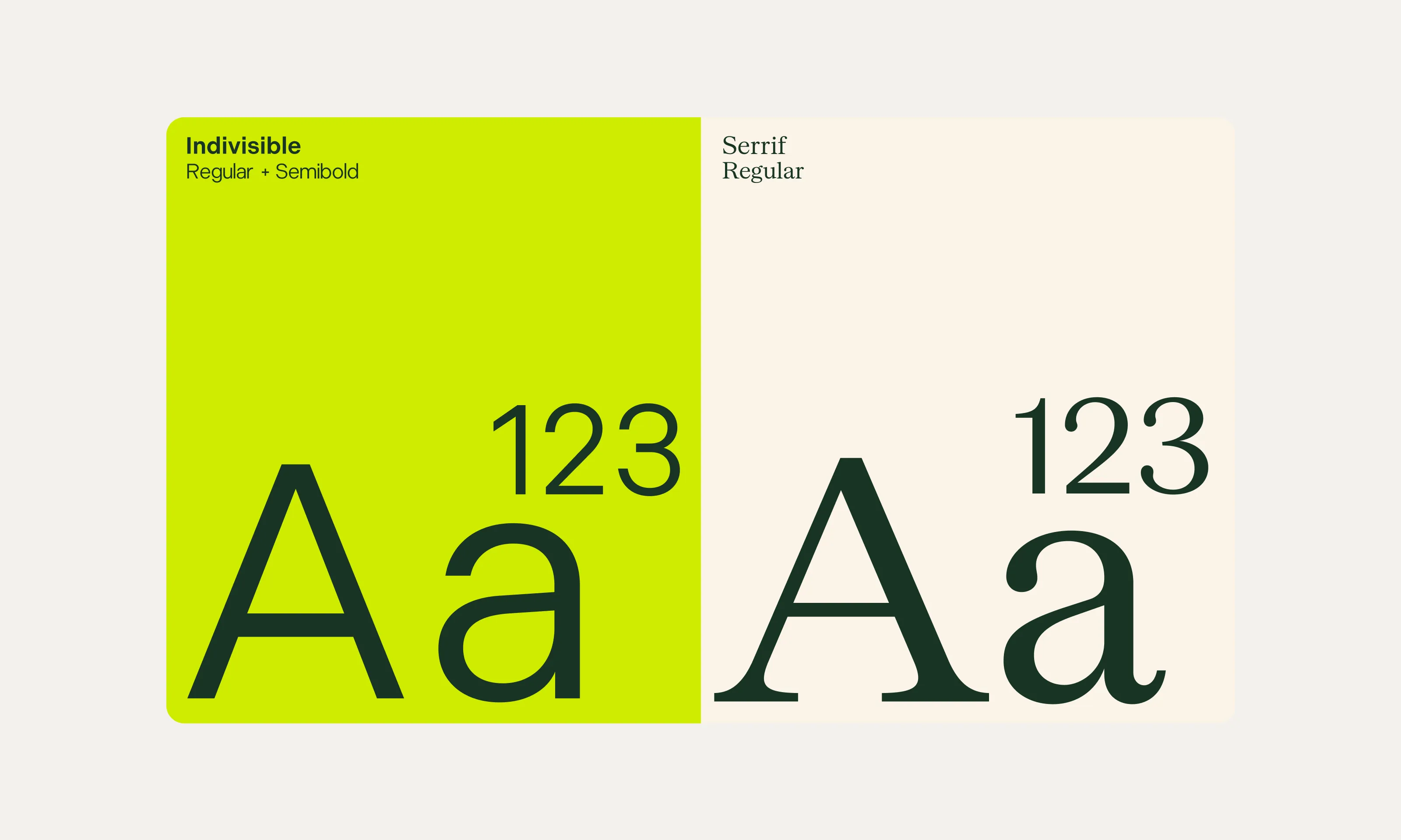
The evolution from Shake Your Plants to syp gave the brand room to grow beyond plant-only ingredients. A refined yellow-lime accent preserves a familiar point of recognition, while a new typography palette introduces serifs for a more mature, assured tone. The identity keeps the brand’s flair and sass while giving it a broader visual language.
Paragraph
Video file
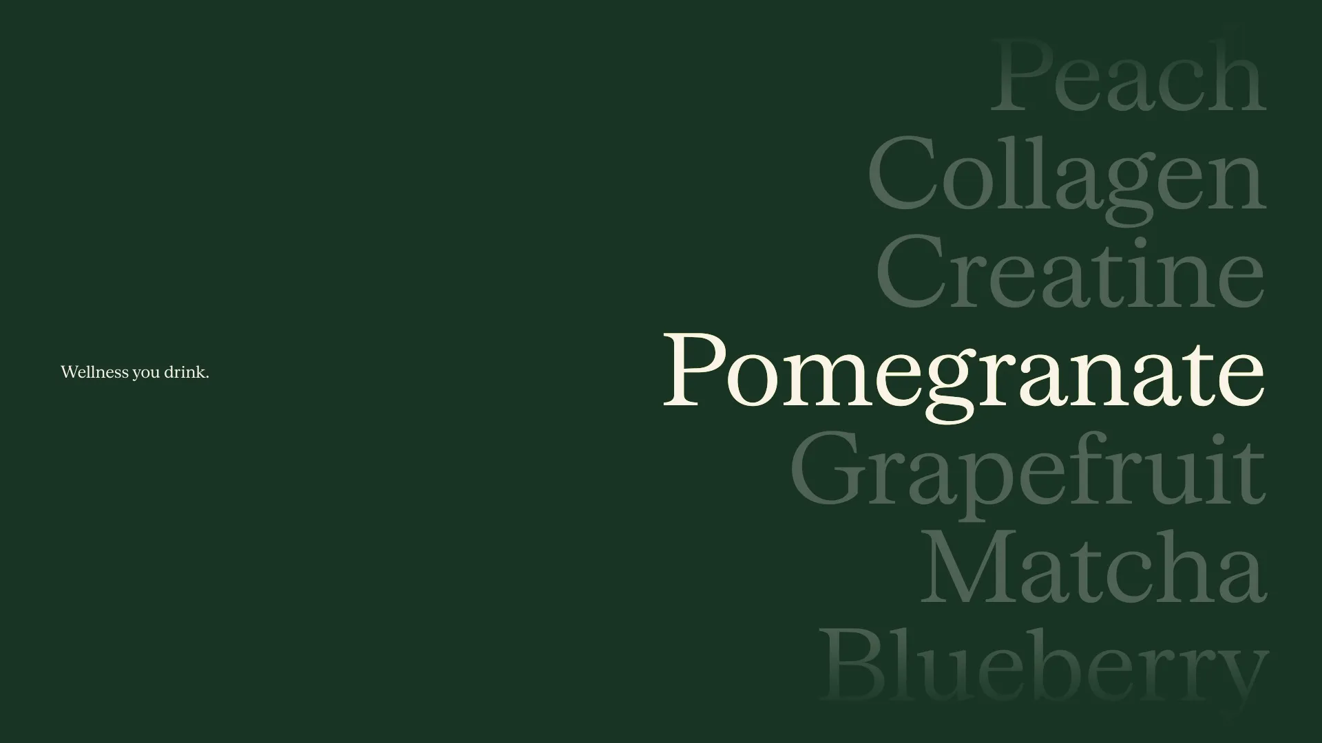
Across boxes and sachets, the information follows a clear order: product category, benefit, then flavour. Repeated layout studies, product-adviser input and digital research shaped a system designed to help people navigate the range and distinguish products on the shelf. The signature yellow-lime footer ties the packaging together, carrying a recognisable part of the original brand into the new identity.
Paragraph
Video file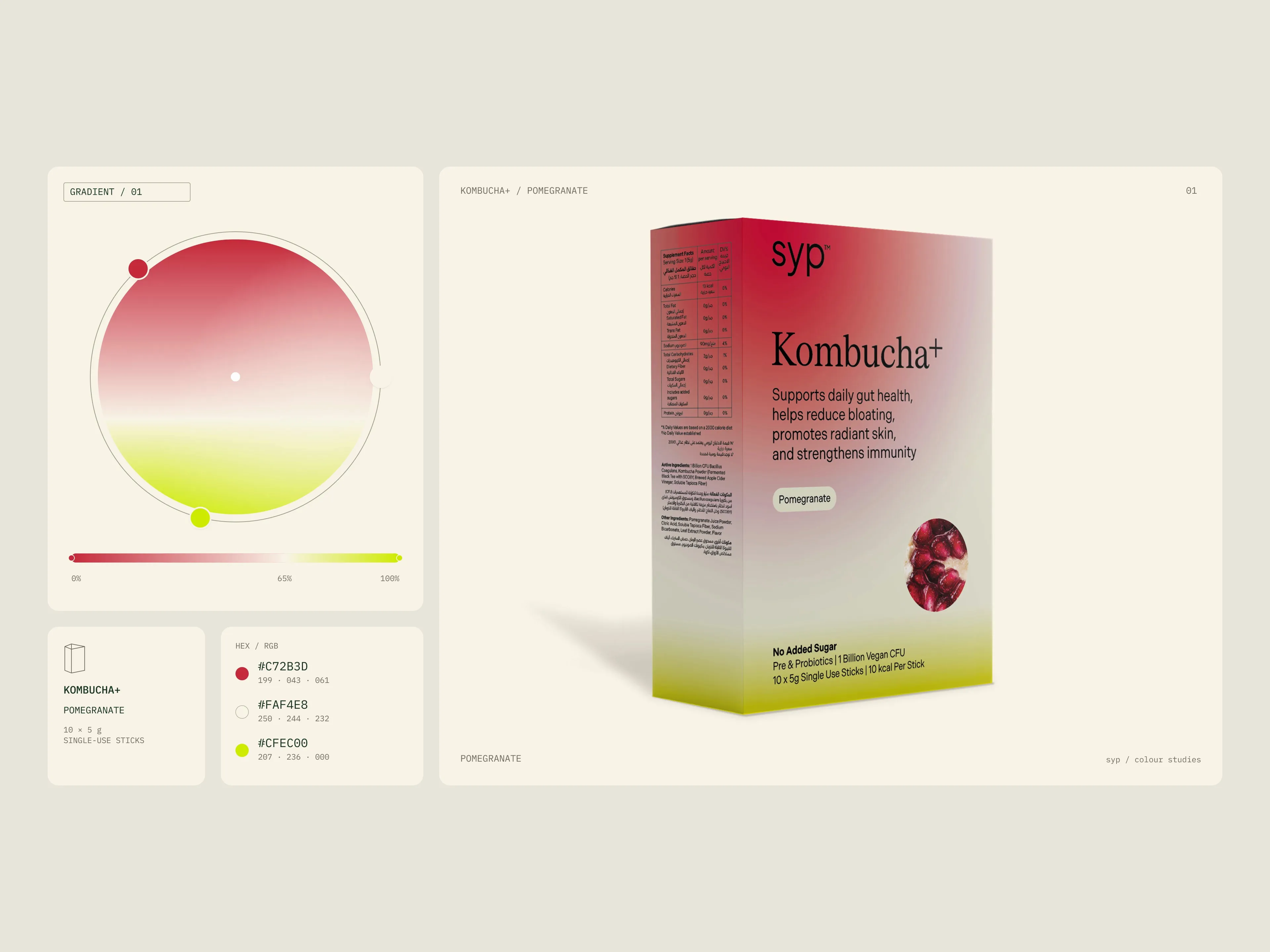

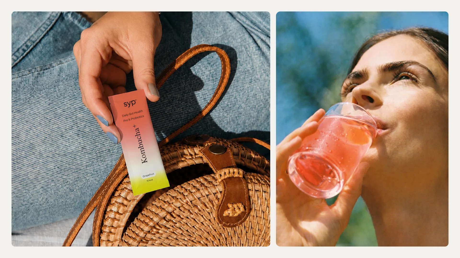

Social assets and templates bring the new identity into everyday communication. Colour, typography and tone of voice carry across the designs, supported by guidelines that give the team a consistent starting point for new content. The system extends syp’s presence beyond the pack while keeping its personality intact.
Paragraph
Video file

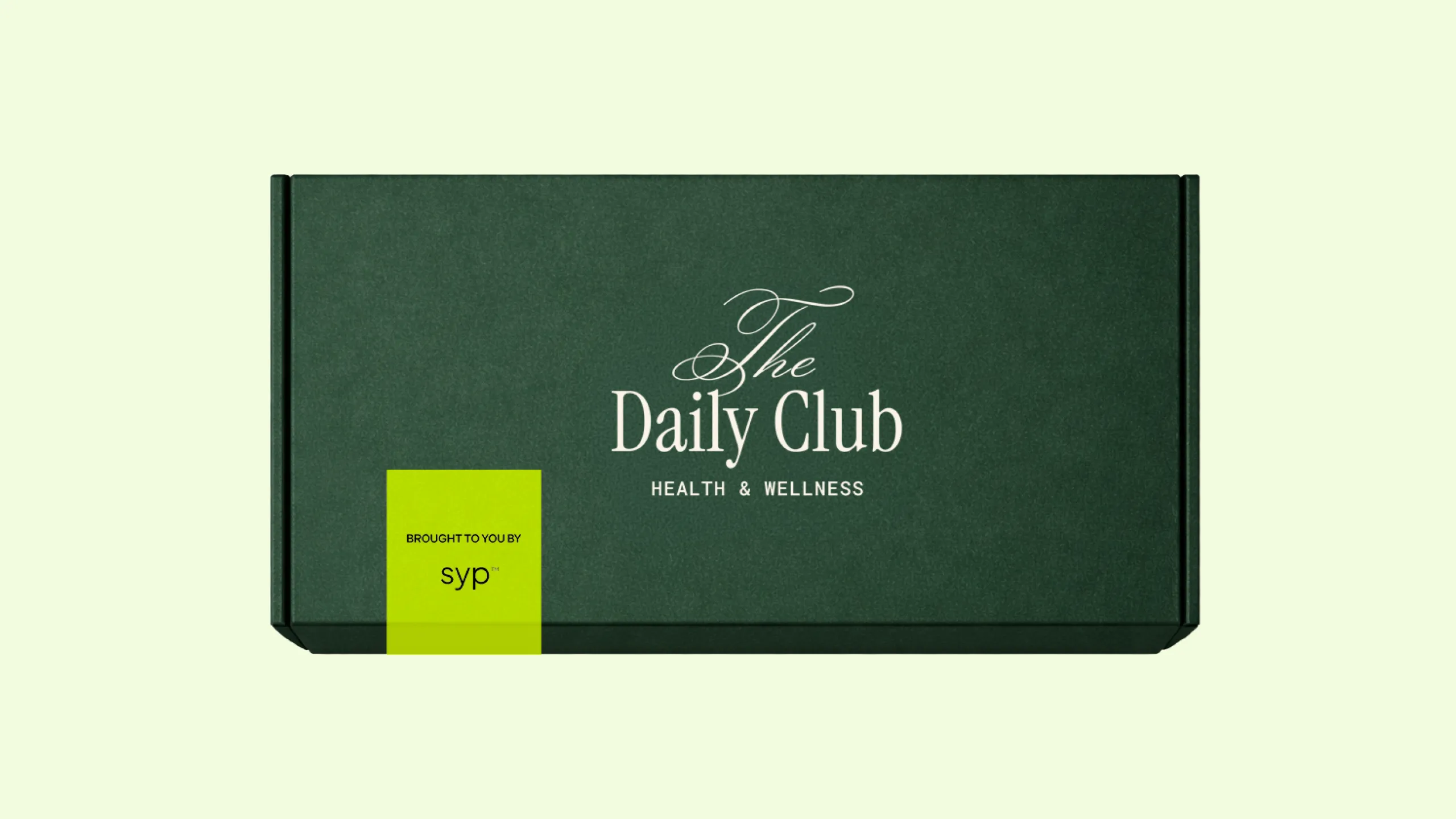
Merchandise extends syp into everyday use, from tote bags and T-shirts to pieces created for product launches. We also developed The Daily Club, a concept built around the appeal of an invitation-only community for syp’s audience. It gives the merchandise a shared idea beyond the logo: the feeling of belonging to the brand’s world.
Paragraph
Video file




syp is a UAE-based wellness brand offering functional blends for everyday routines. Originally known as Shake Your Plants, the business was expanding beyond plant-only ingredients and needed a brand that could grow with it. Its packaging needed to communicate products and flavours more clearly, while the existing accent colour and gradients were difficult to reproduce consistently in print.
GOODD was asked to bring greater clarity and maturity to the brand while keeping its flair and sass. Beginning with strategy, positioning and tone of voice, we developed a direction that made the broader offer easier to understand. The aim was to build on what people recognised, giving syp a fuller set of assets and clear guidance for using them.
The name became syp, retaining a reference to how the products are consumed while moving beyond the original plant-only premise. We refined the familiar yellow-lime accent and introduced a new typography palette with serifs, bringing a more assured tone to the identity without losing its personality.
Packaging put that clarity into practice, with a hierarchy designed to help people understand the products and navigate the range. Social assets, templates, merchandise and press kits extended the identity across the brand’s communications. The Daily Club, a concept for syp’s merchandise, introduced a sense of belonging around the brand. Together with the brand guidelines, these applications gave the team a consistent foundation for everyday use and future launches.
---
Creative Director: Bechara Malak
Brand Designer: Nina Courtney
Senior Designer: Khachig Charshafjian
Frontier25
Brand Rollout Brand Guidelines Development Event & Environmental Design Editorial Design Presentations Social Content
frontier25
Next video