
Two Suns
A brand shaped by a Devon family farm, where tea is grown, picked and made by hand.
Brand Strategy Art Direction Verbal Identity Visual Identity Packaging Web Design & Development
two-suns
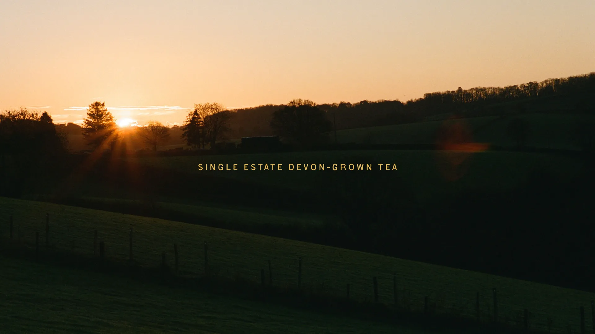
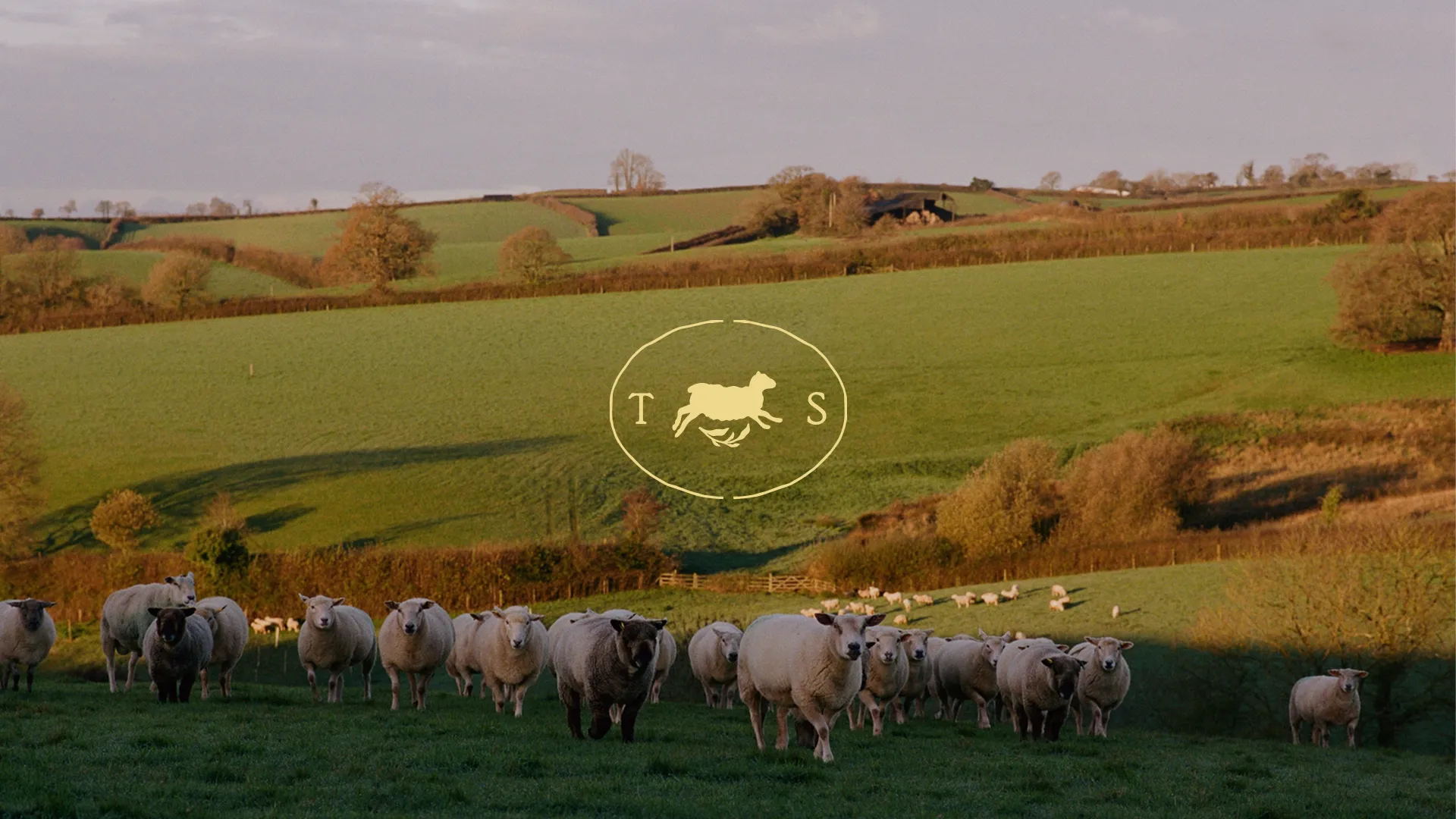
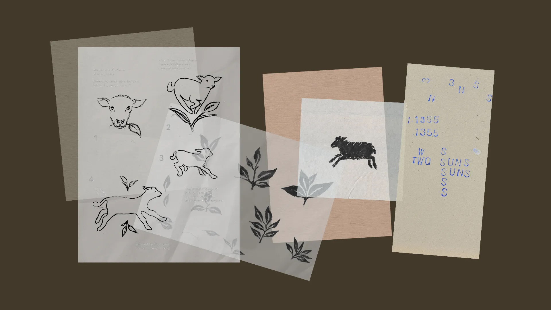
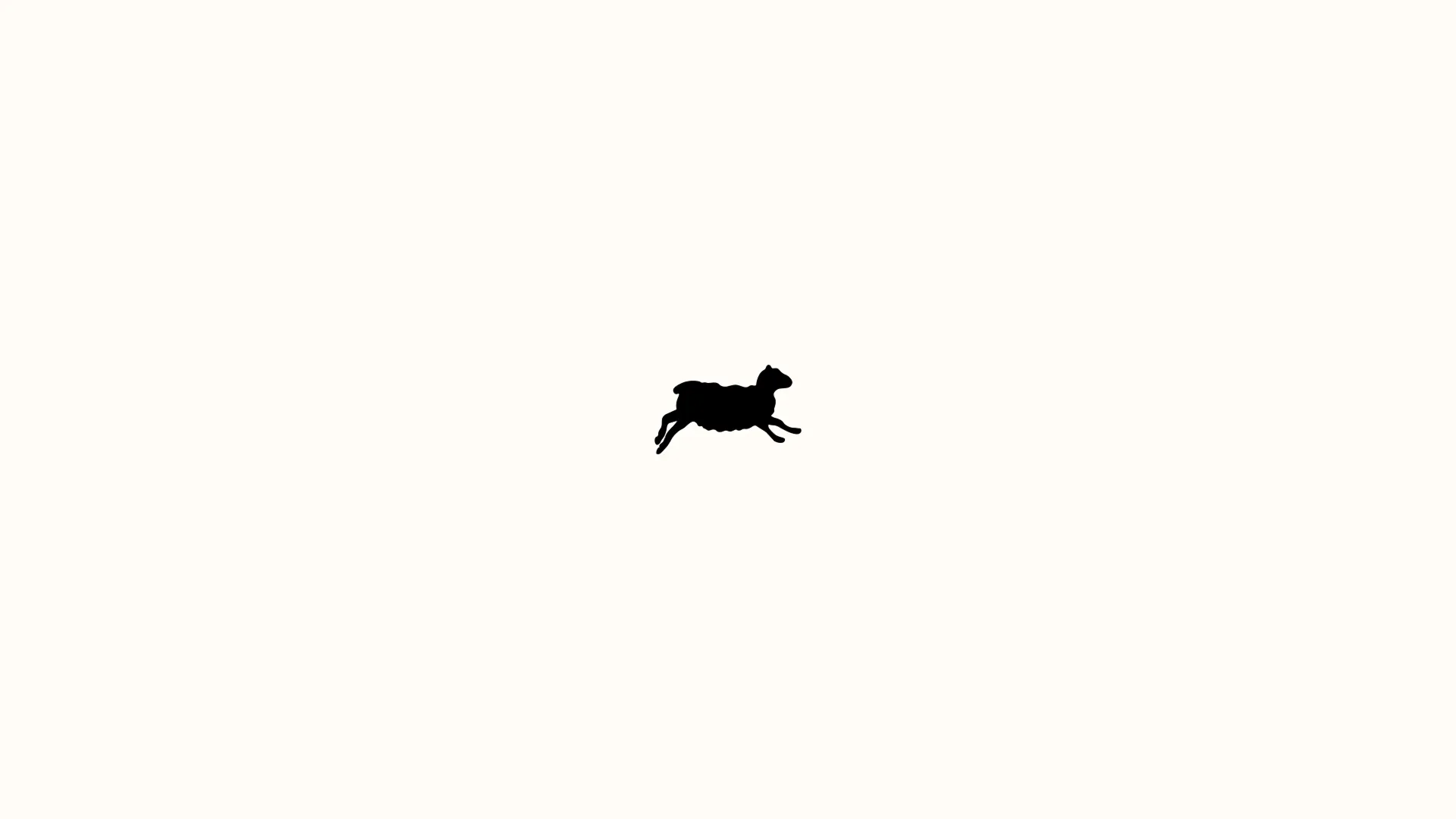
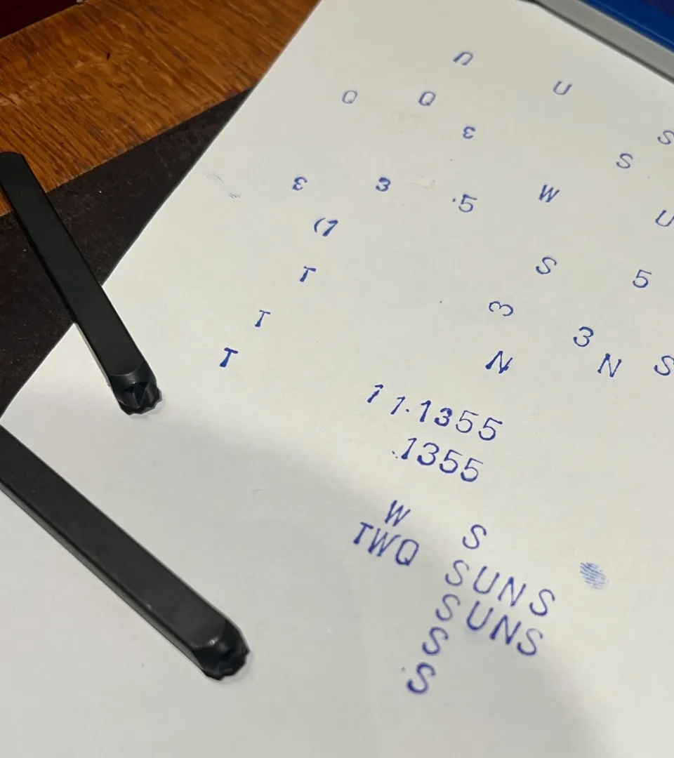
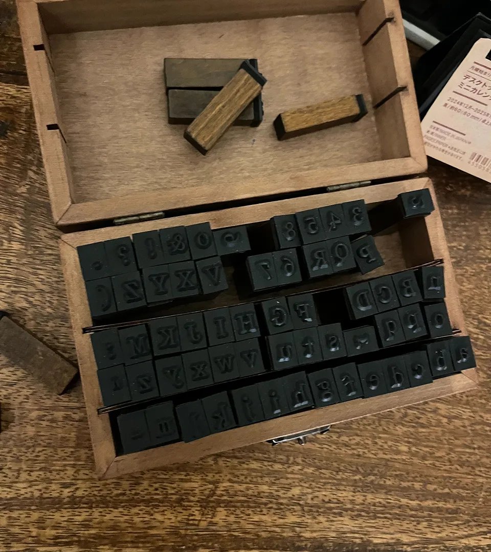
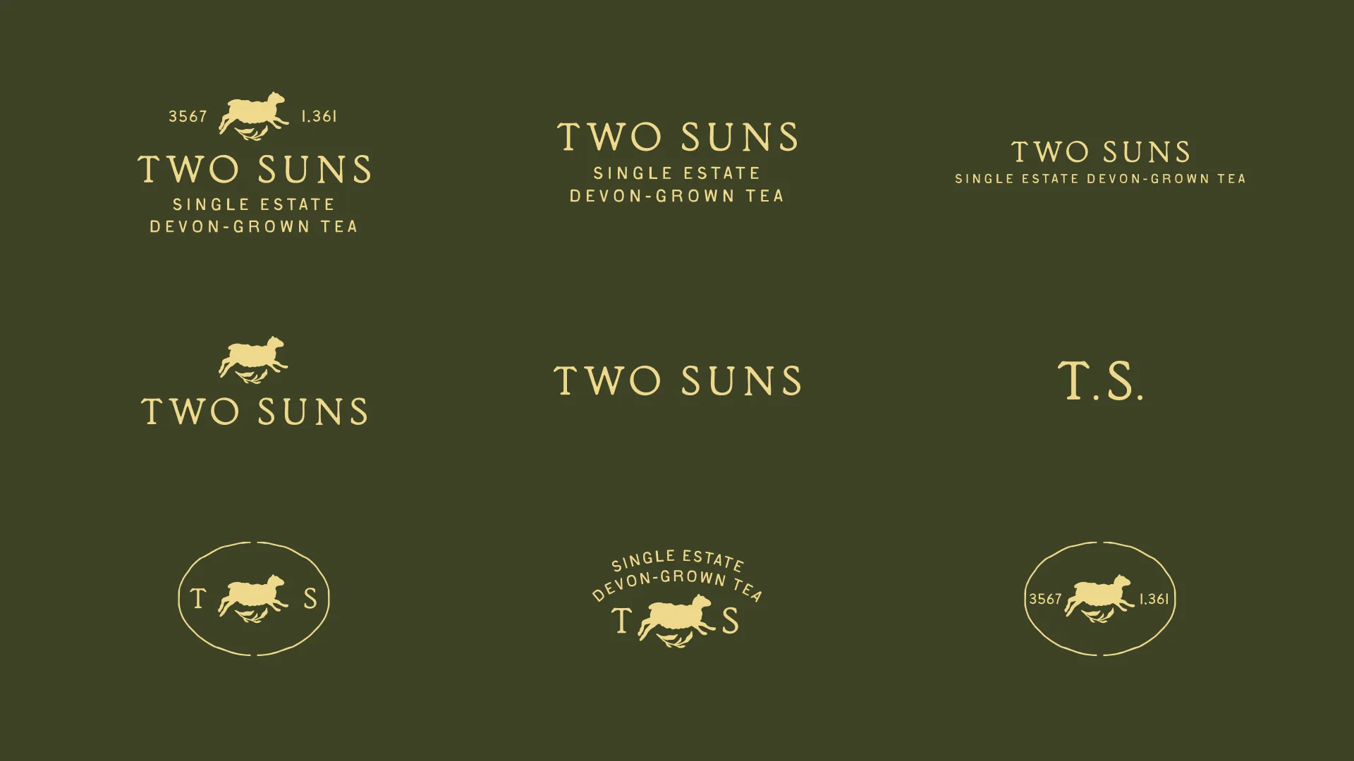
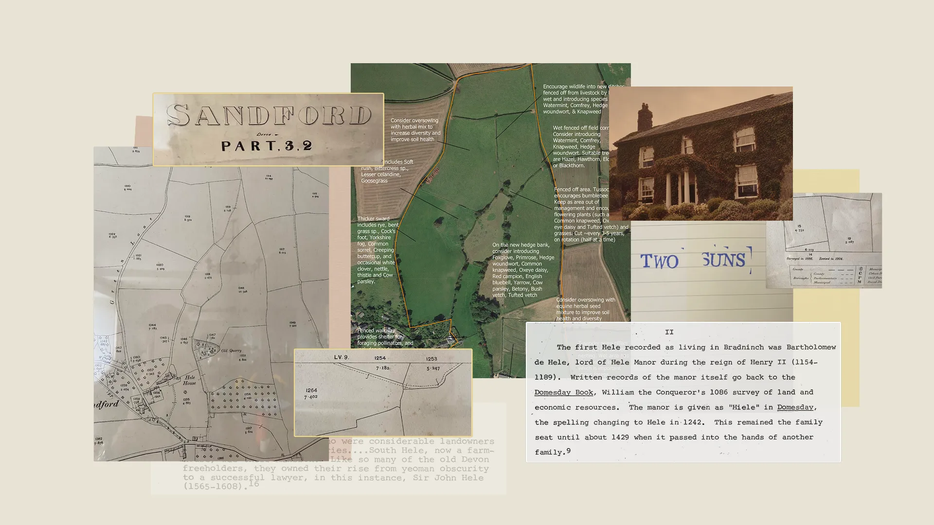
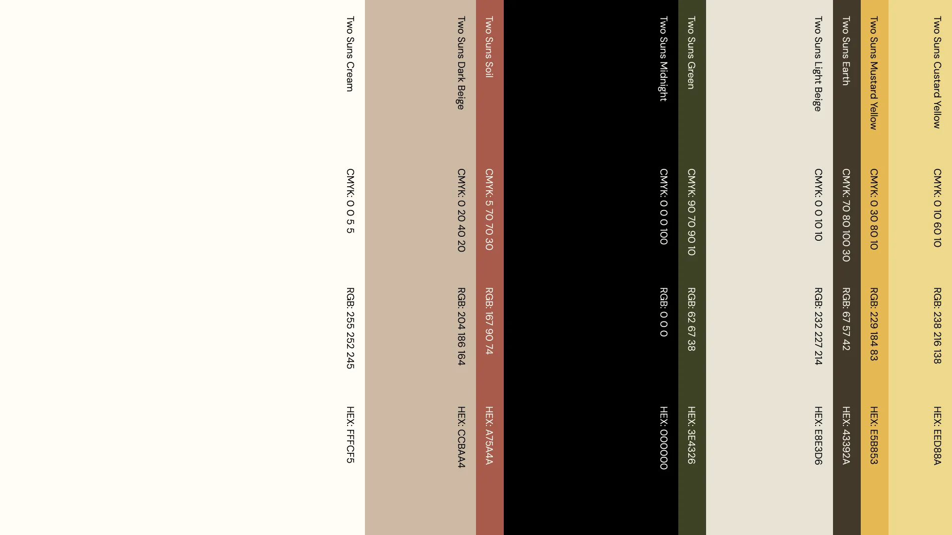
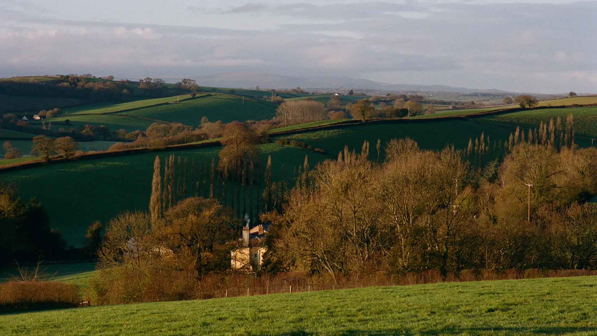
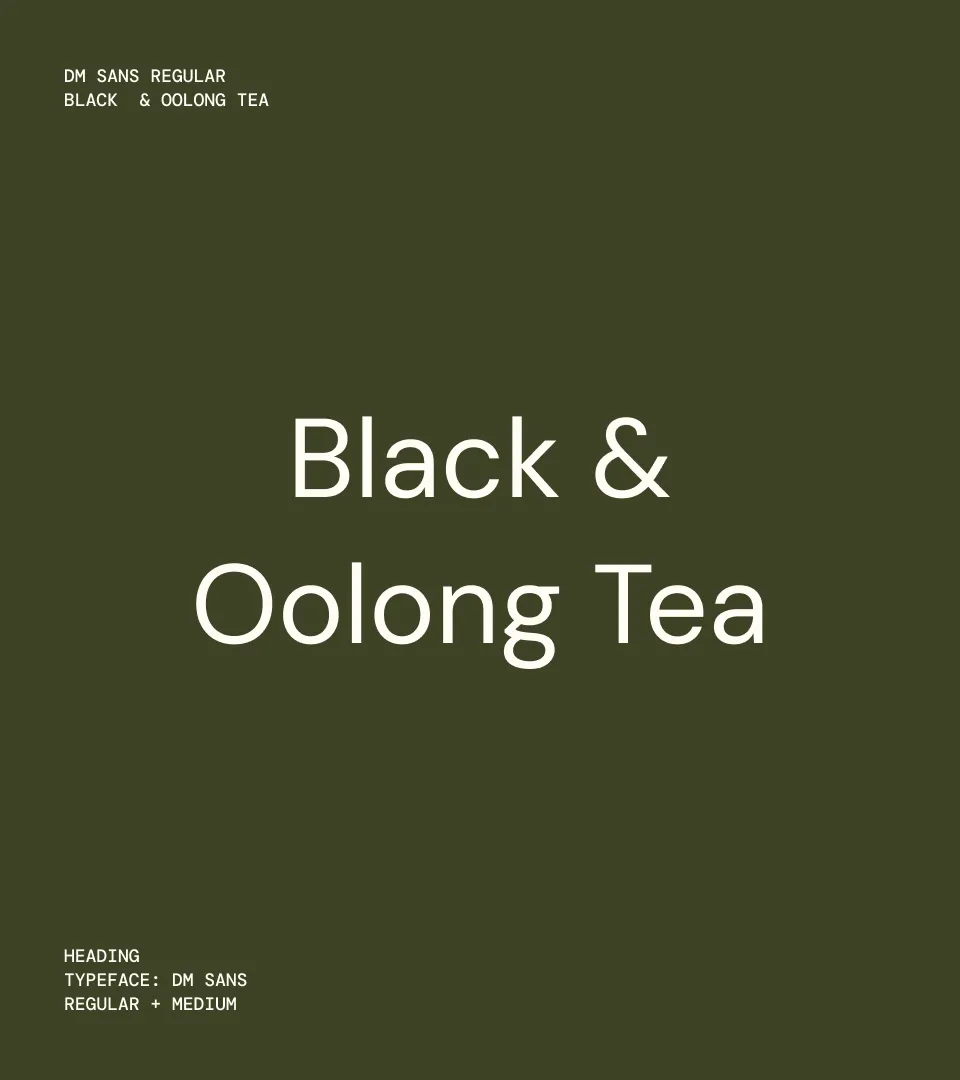
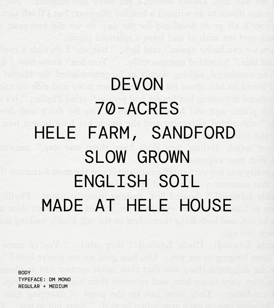
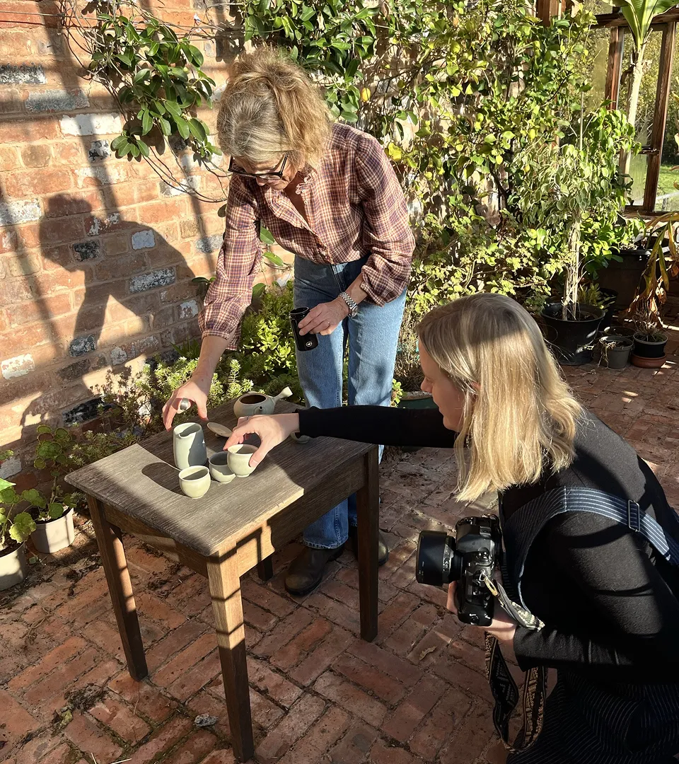
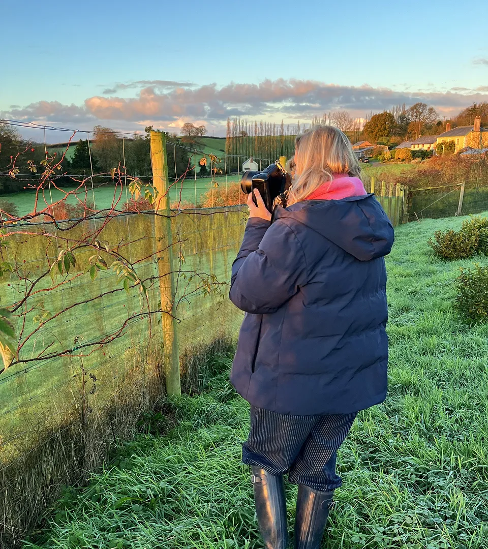
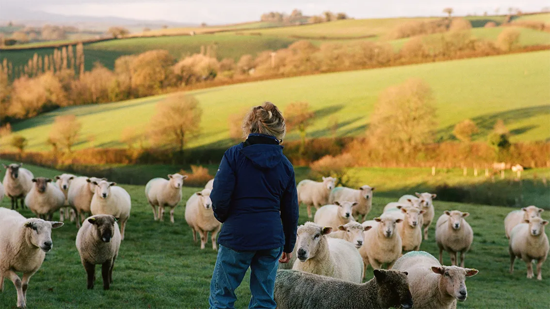
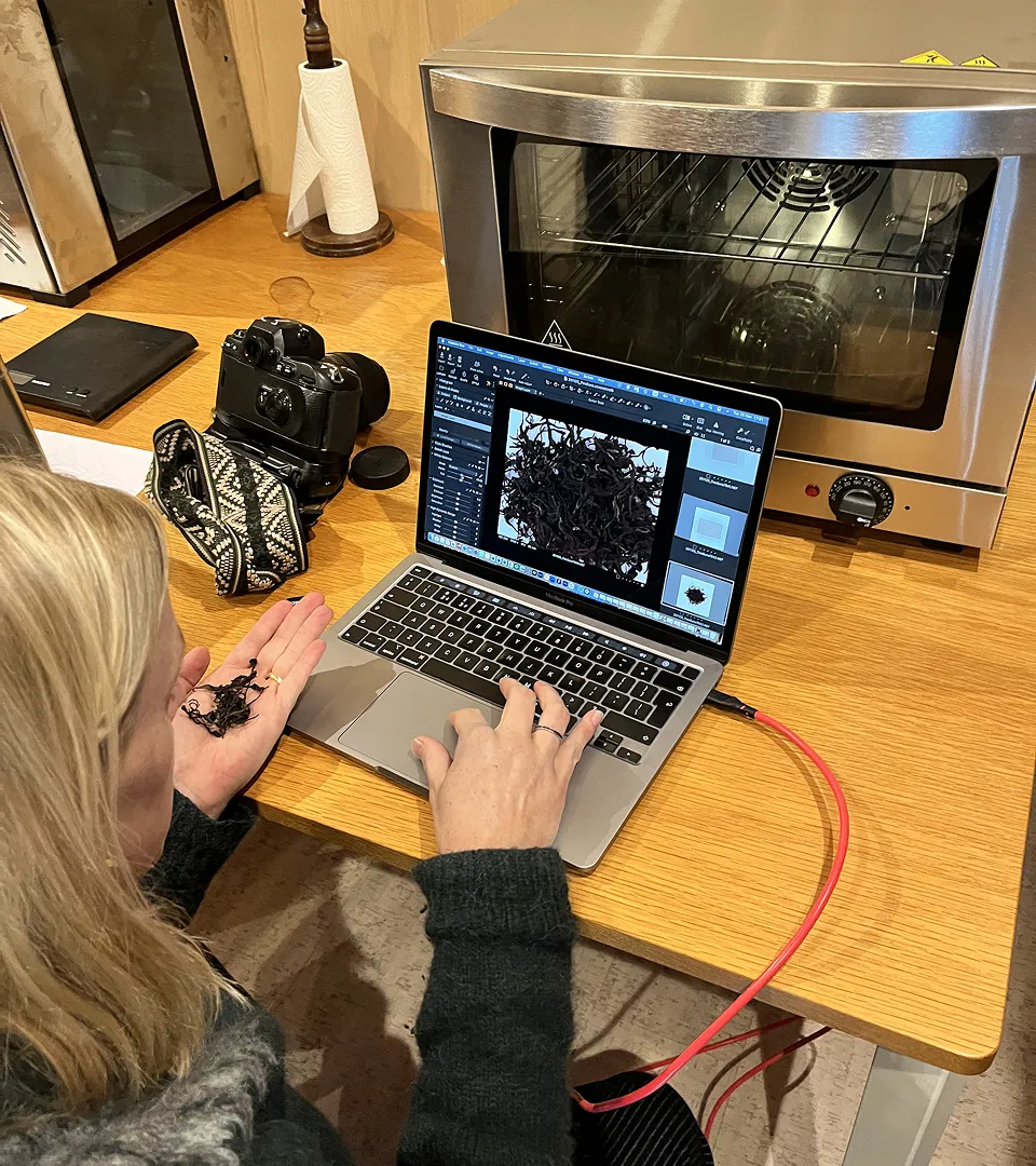
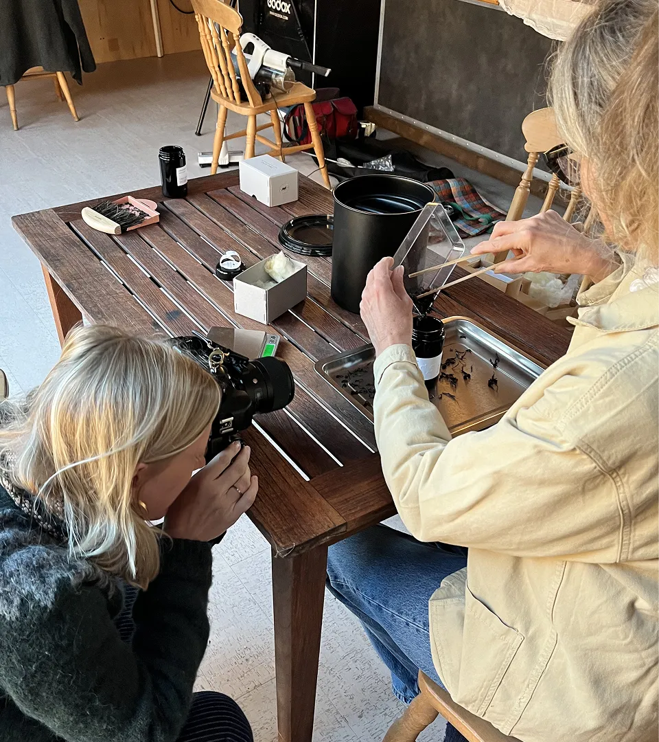
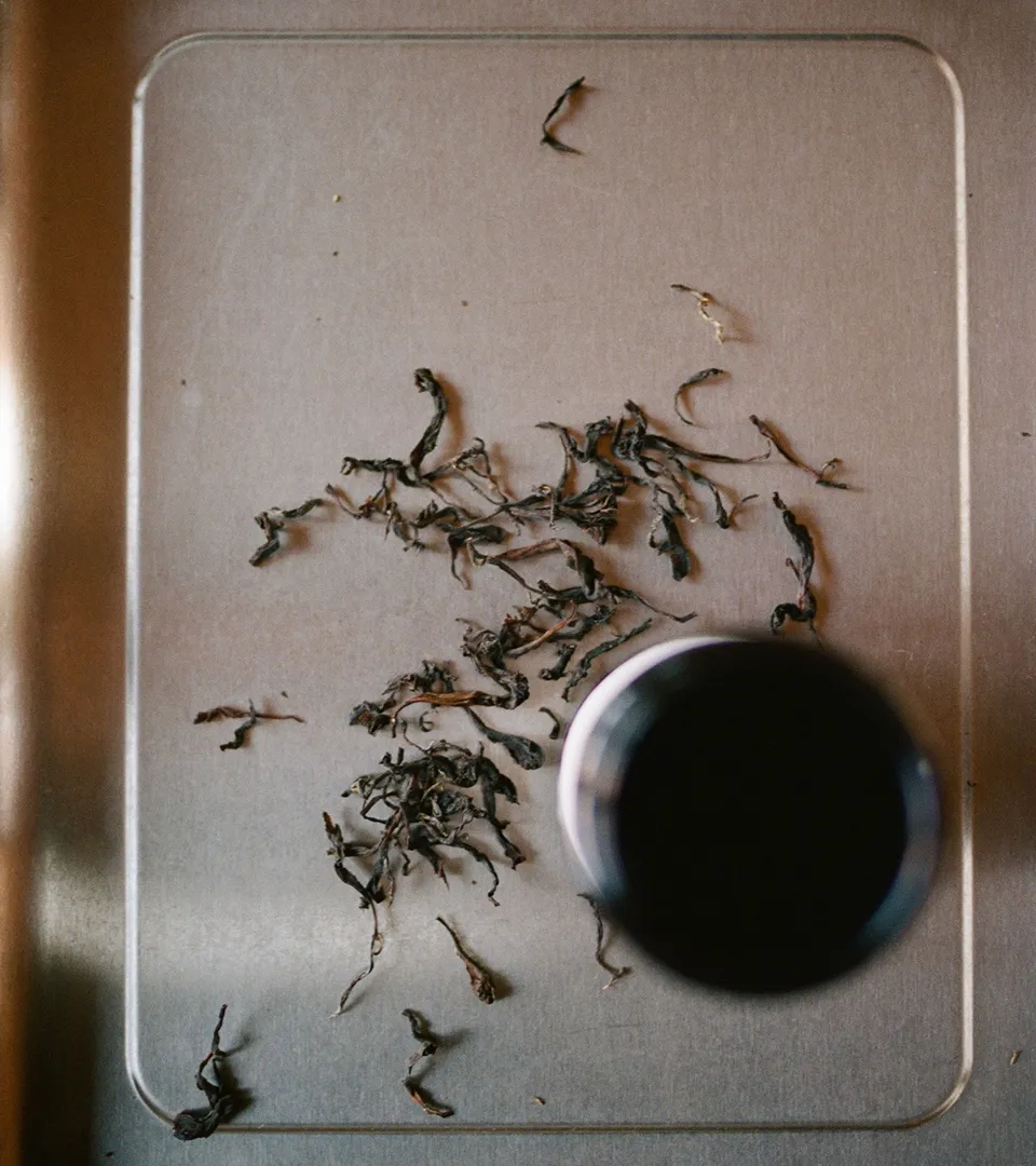
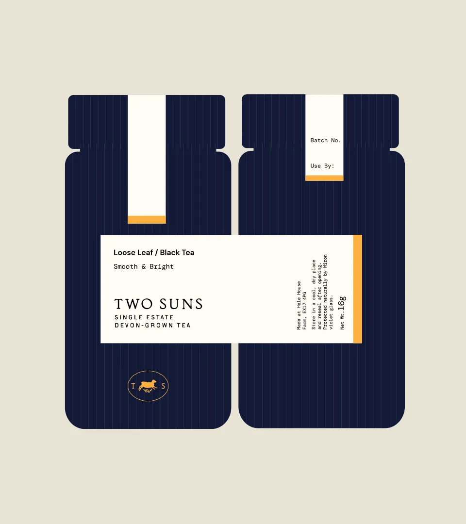
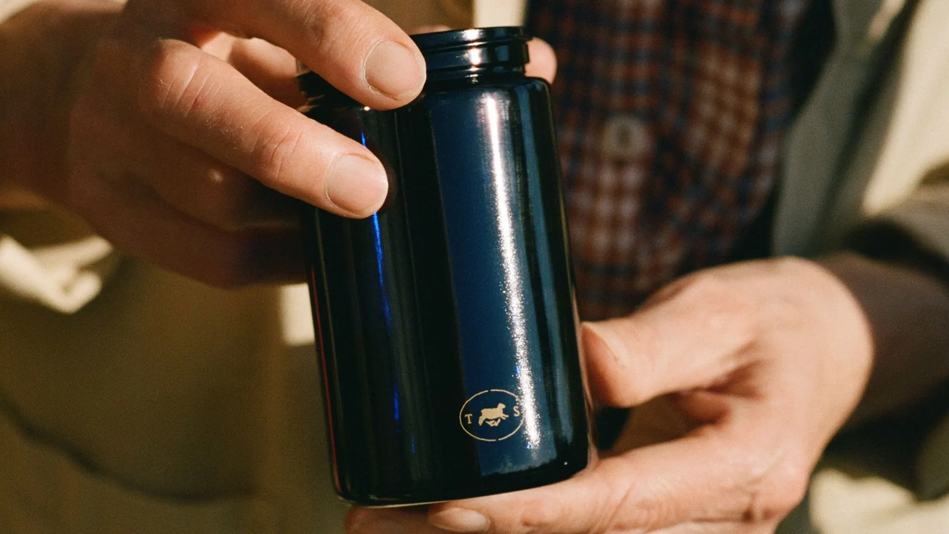
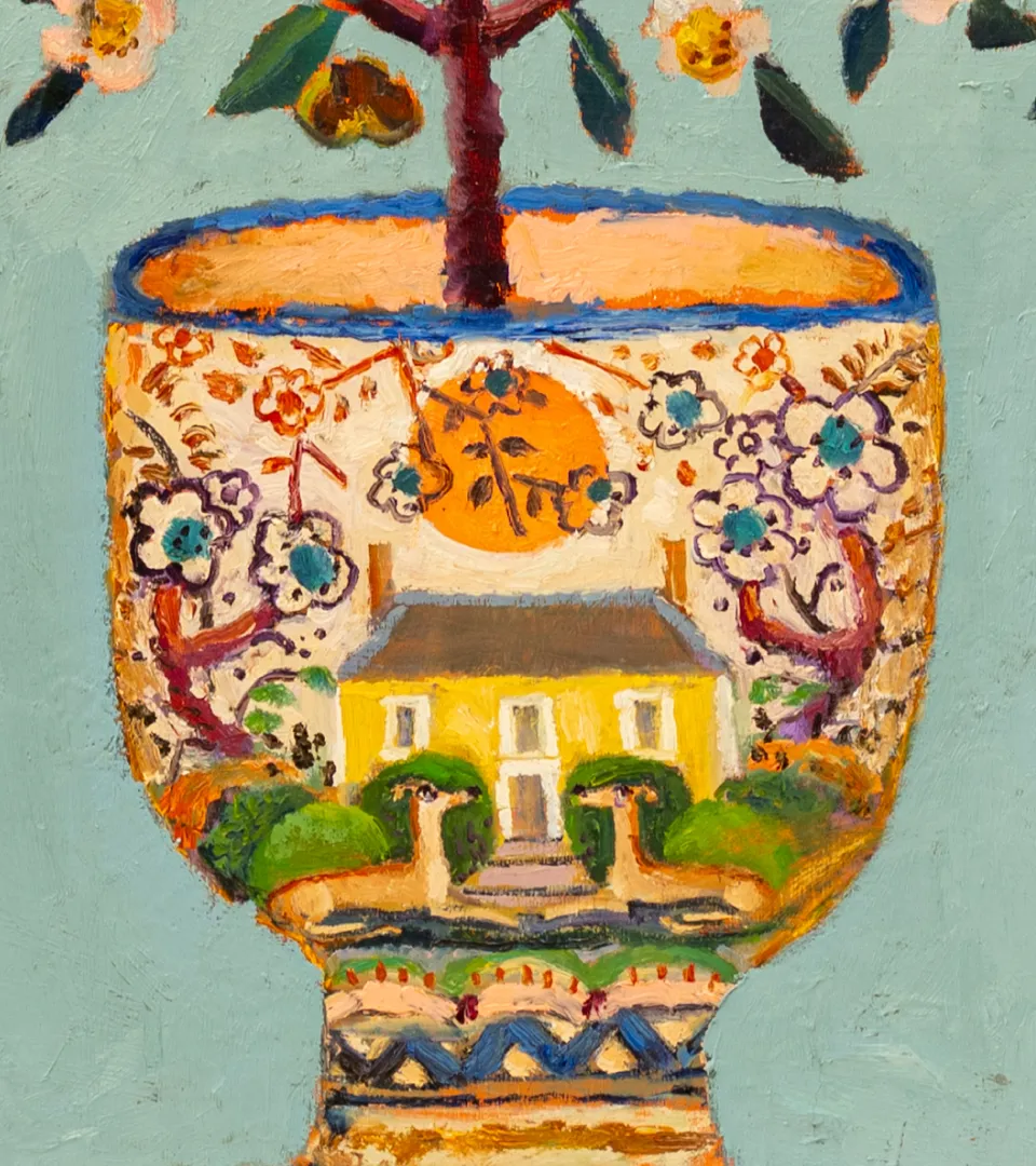
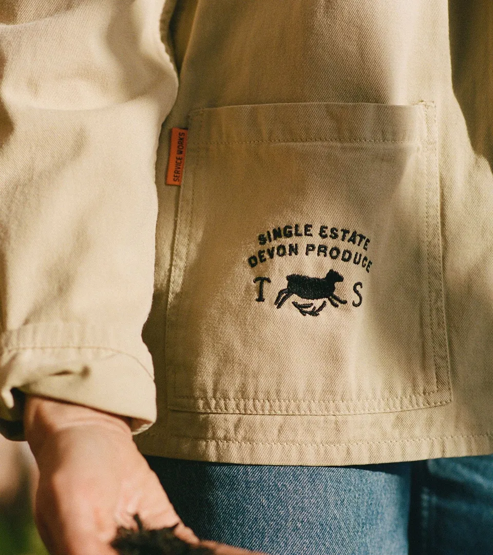
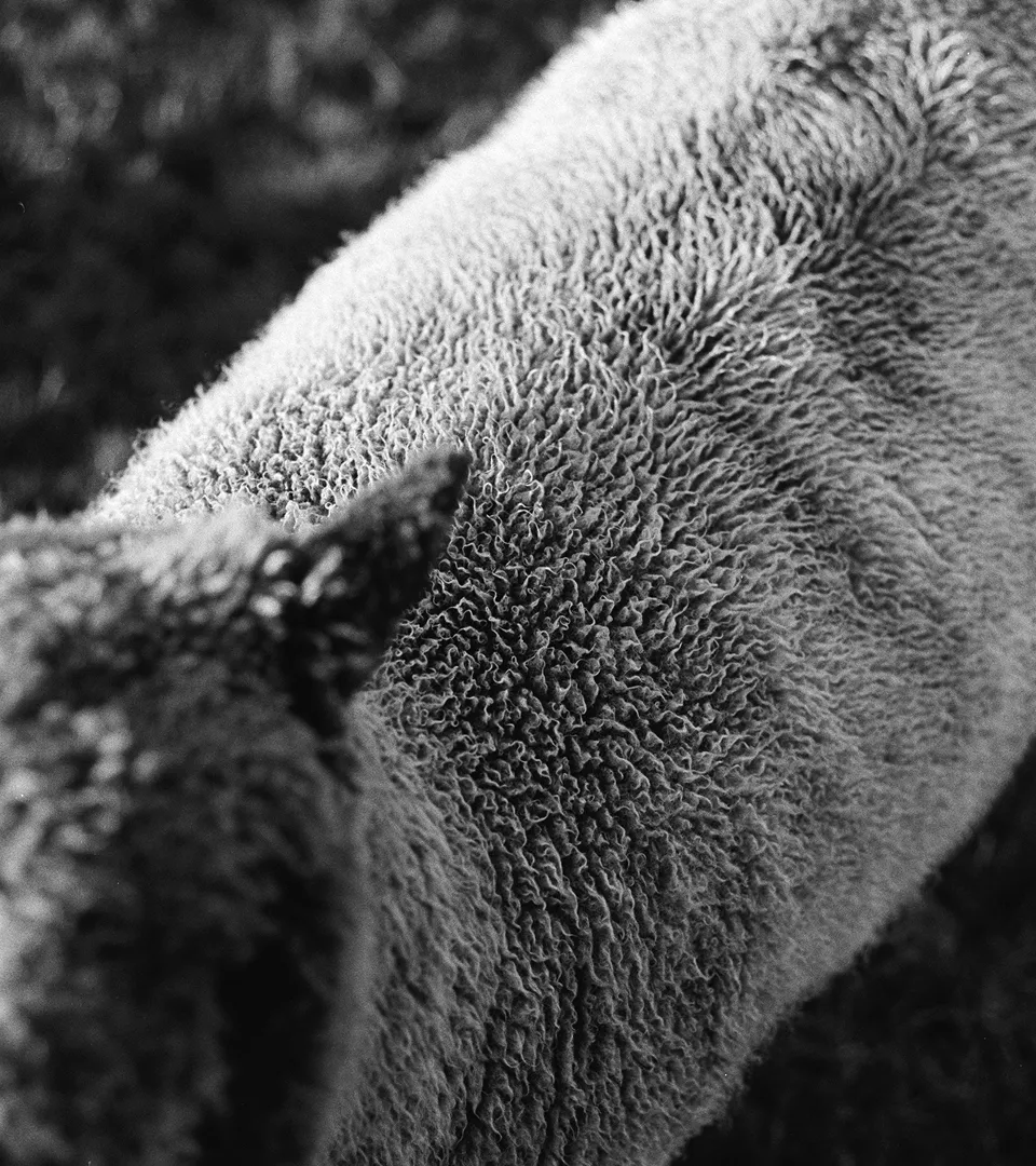
We began with old maps and photographs of Hele Farm, alongside research into nineteenth-century serif lettering. The wordmark was drawn by hand, with a supporting typeface whose subtle irregularities sit naturally beside it. A sheep symbol acknowledges the animals that share the land. The palette comes directly from the farm: brown earth, green tea bushes and hills, red clay from Alison’s tea studio, and the yellow of the family home. Film photography carries that character into the images, preserving warmth, texture and small imperfections.
Paragraph
Video file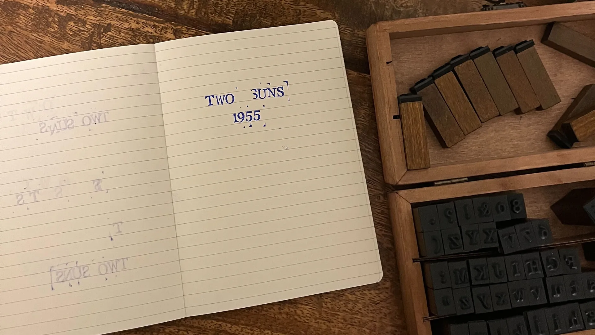
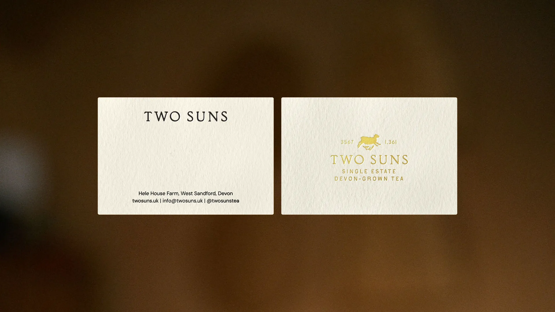
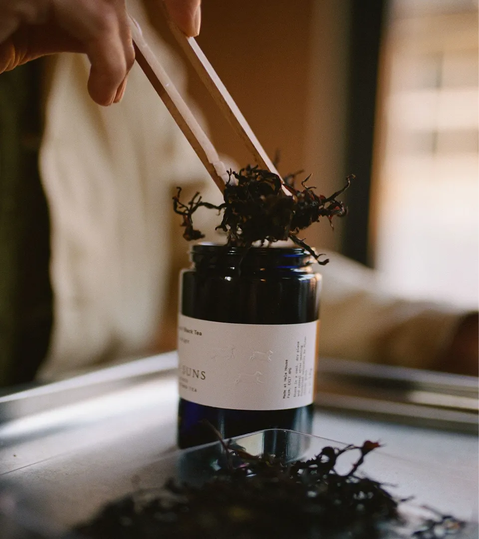
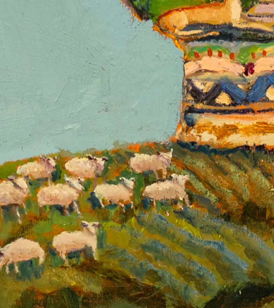
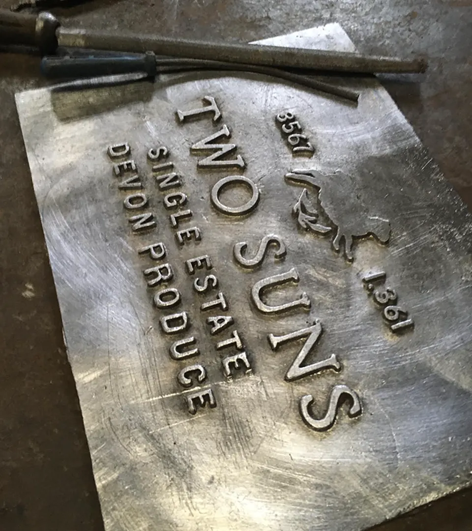
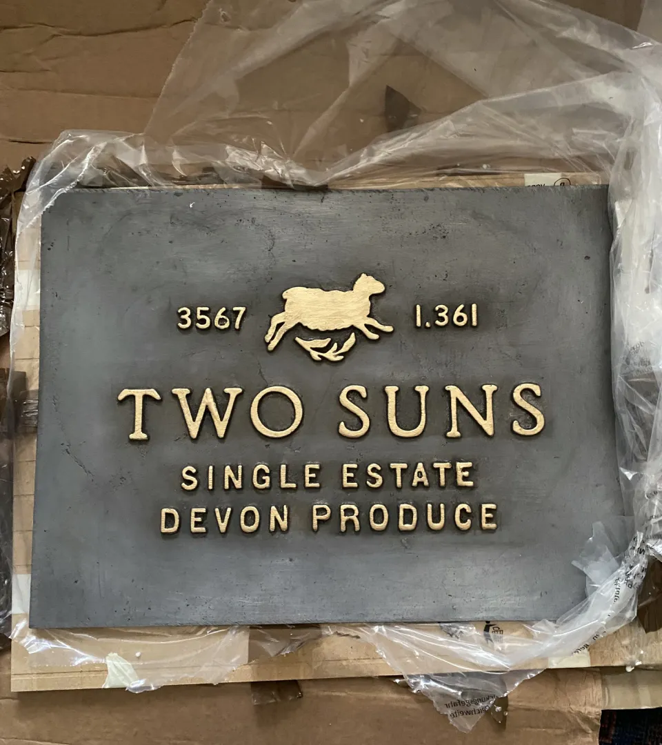
Reusable Miron violet glass jars, sourced from the Netherlands, are placed inside cardboard boxes handmade in the Black Country. Gold hot foil and embossed labels add detail that can be felt as well as seen. Wool from the farm’s own sheep is gently washed and combed to cushion the jars, and can be added to compost or soil after use. A card features Vanessa Cooper’s painting of the farm’s animals, bringing a family friend’s contribution into each box. At the farm itself, a lead sign handmade by Nidderdale Lead is designed to weather into its surroundings.
Paragraph
Video file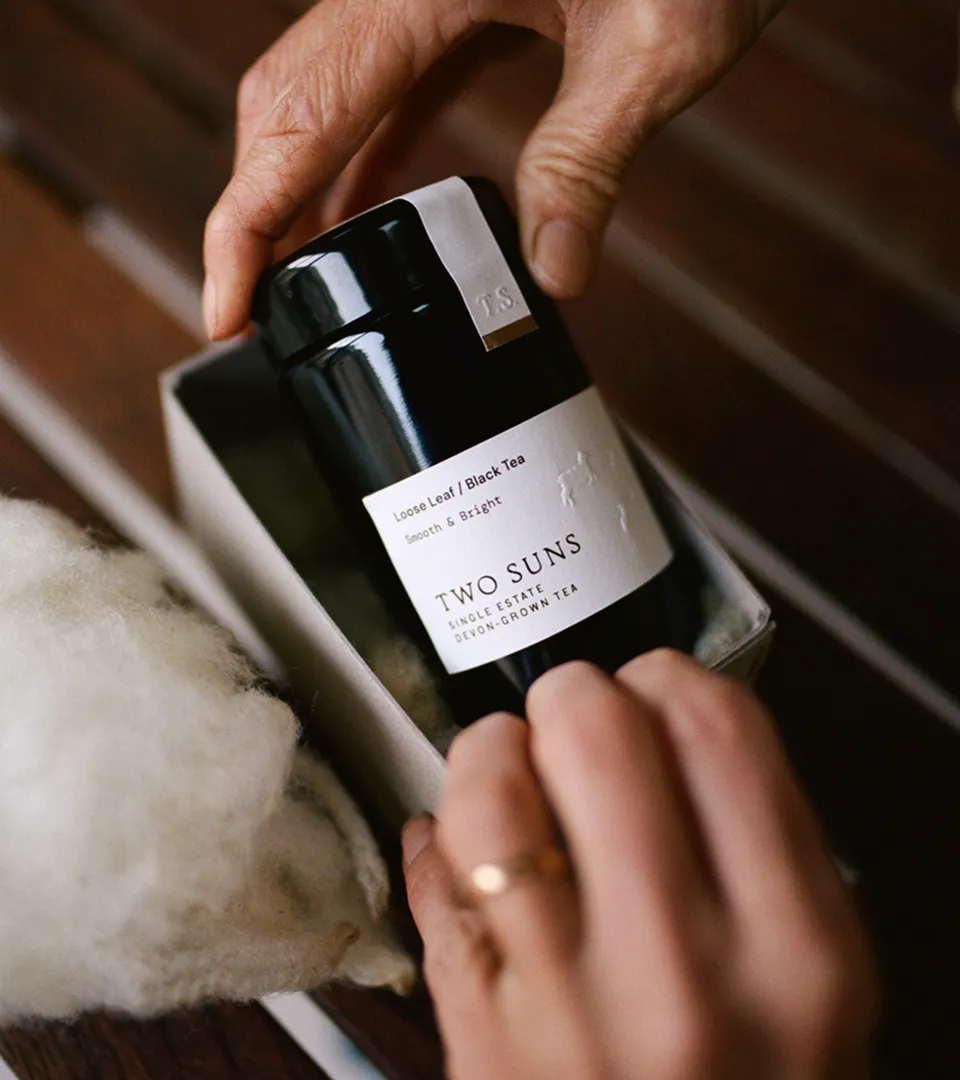
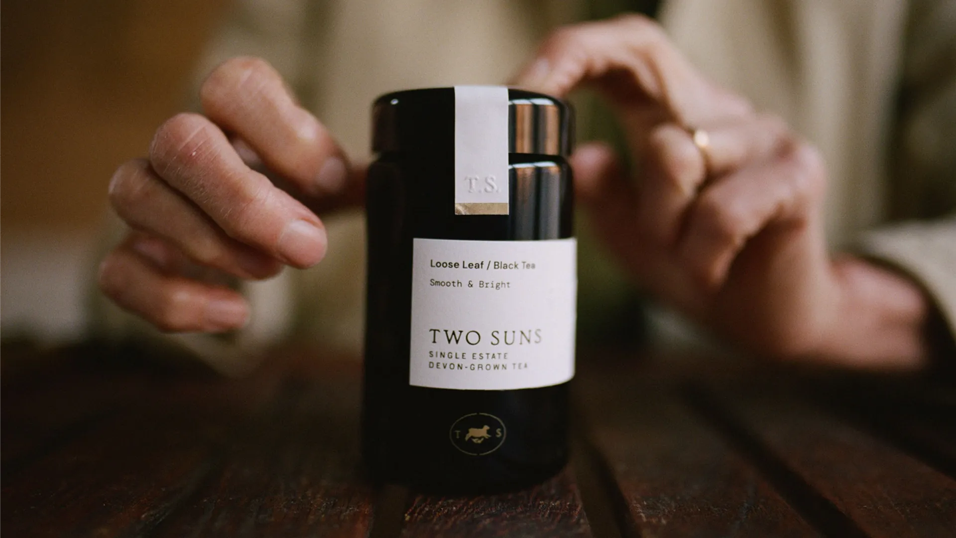
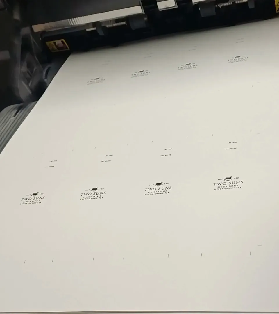
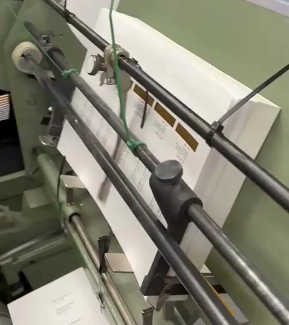
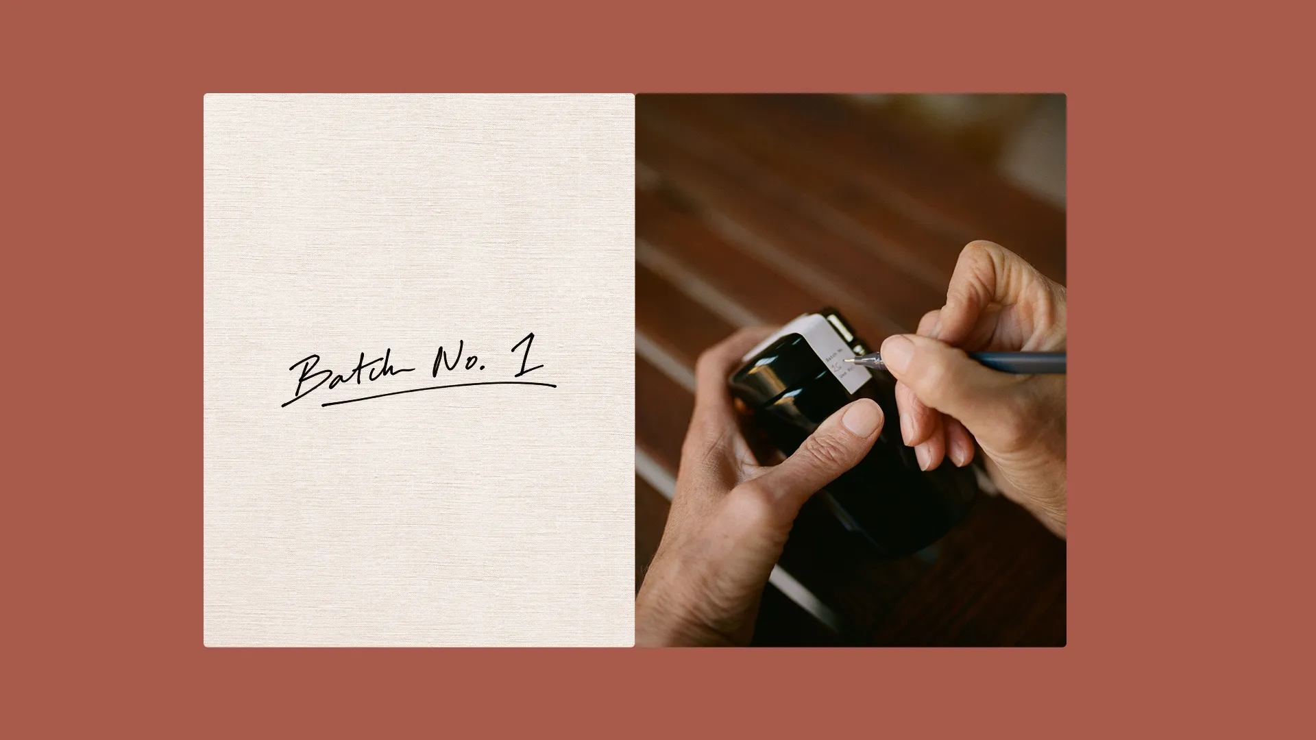
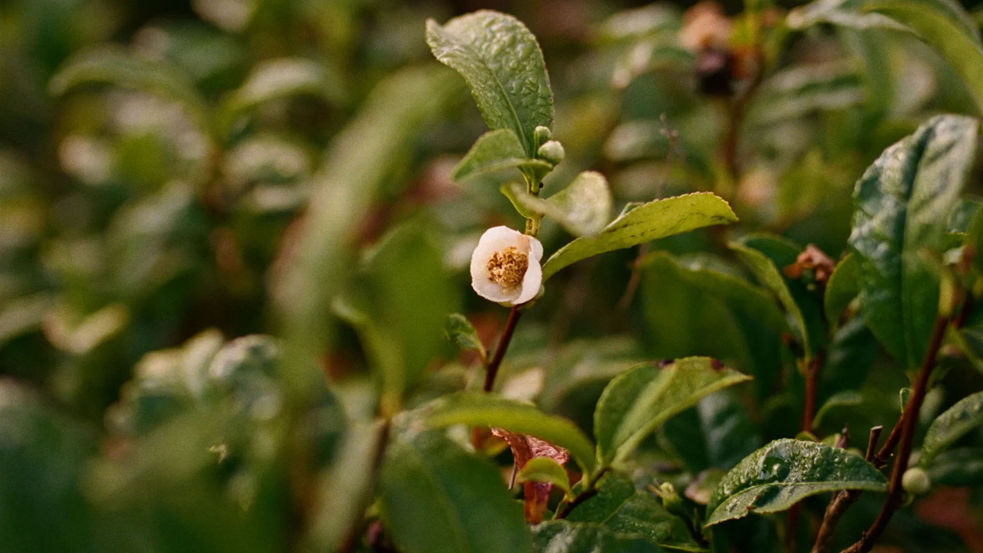
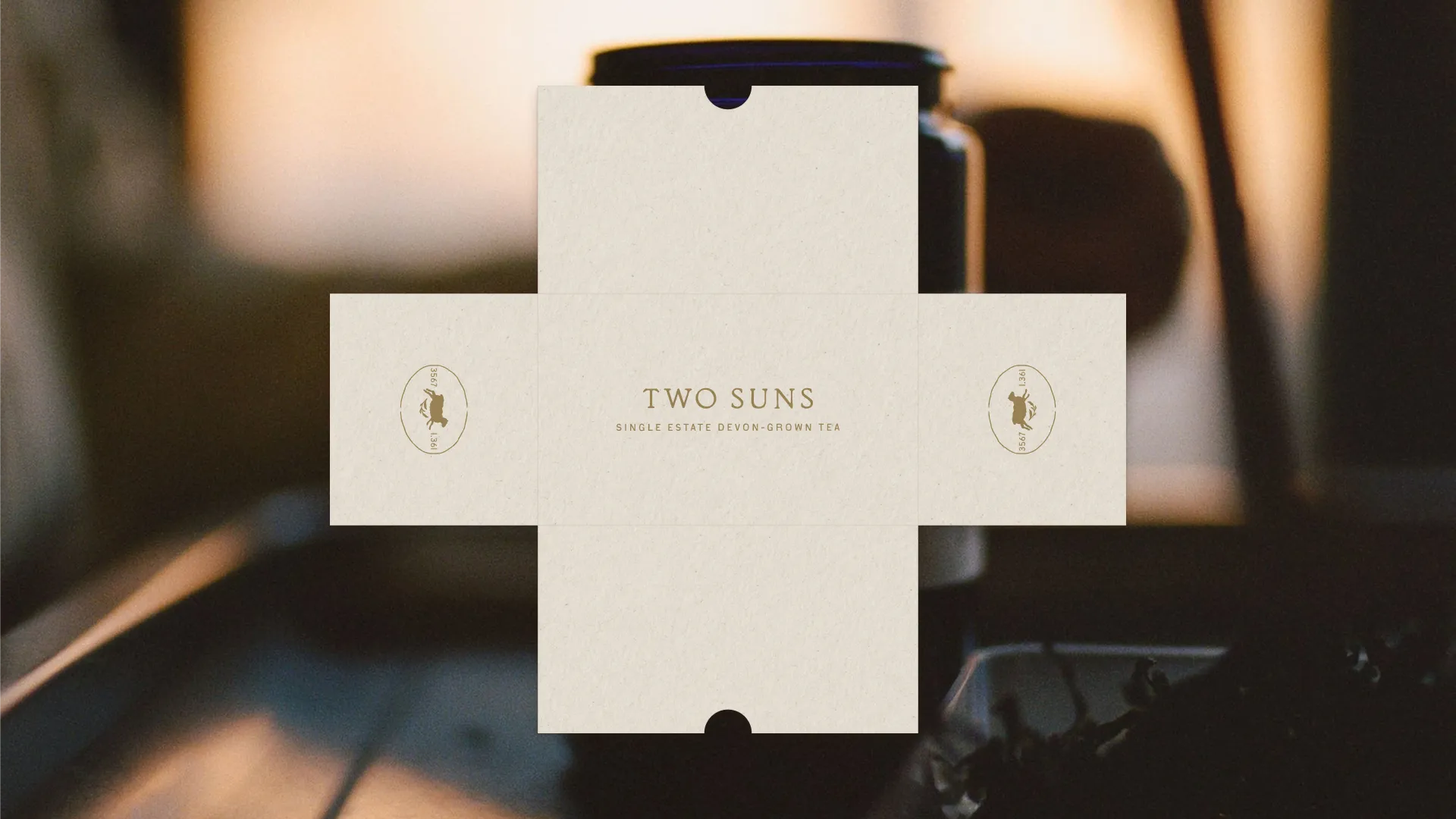
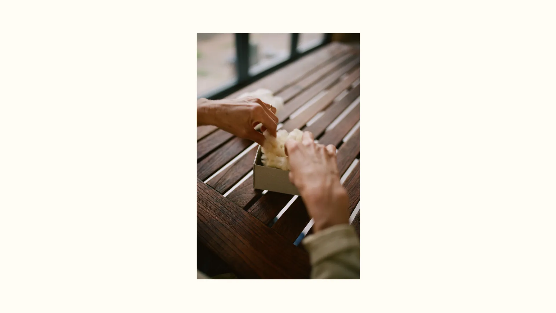
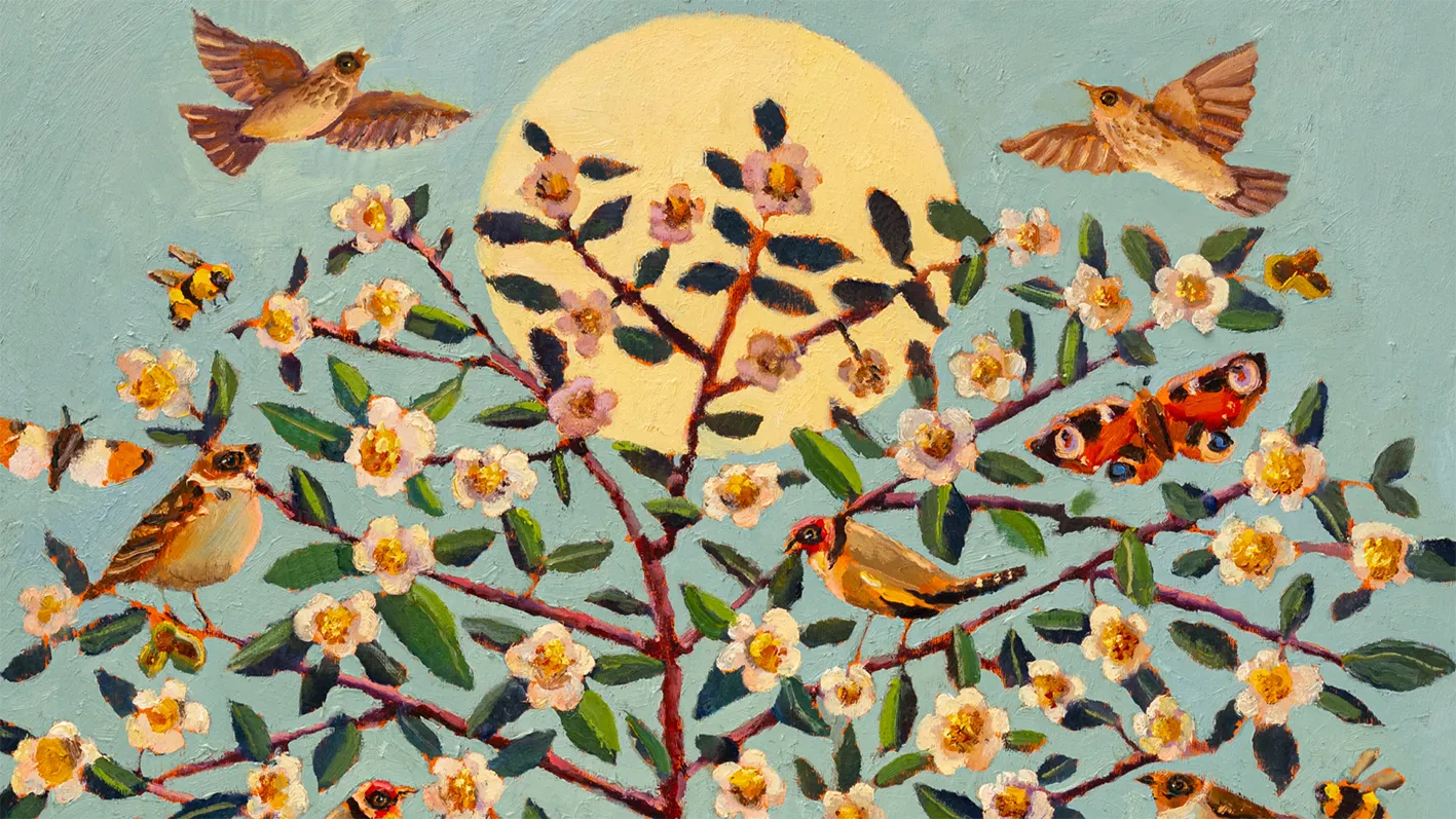
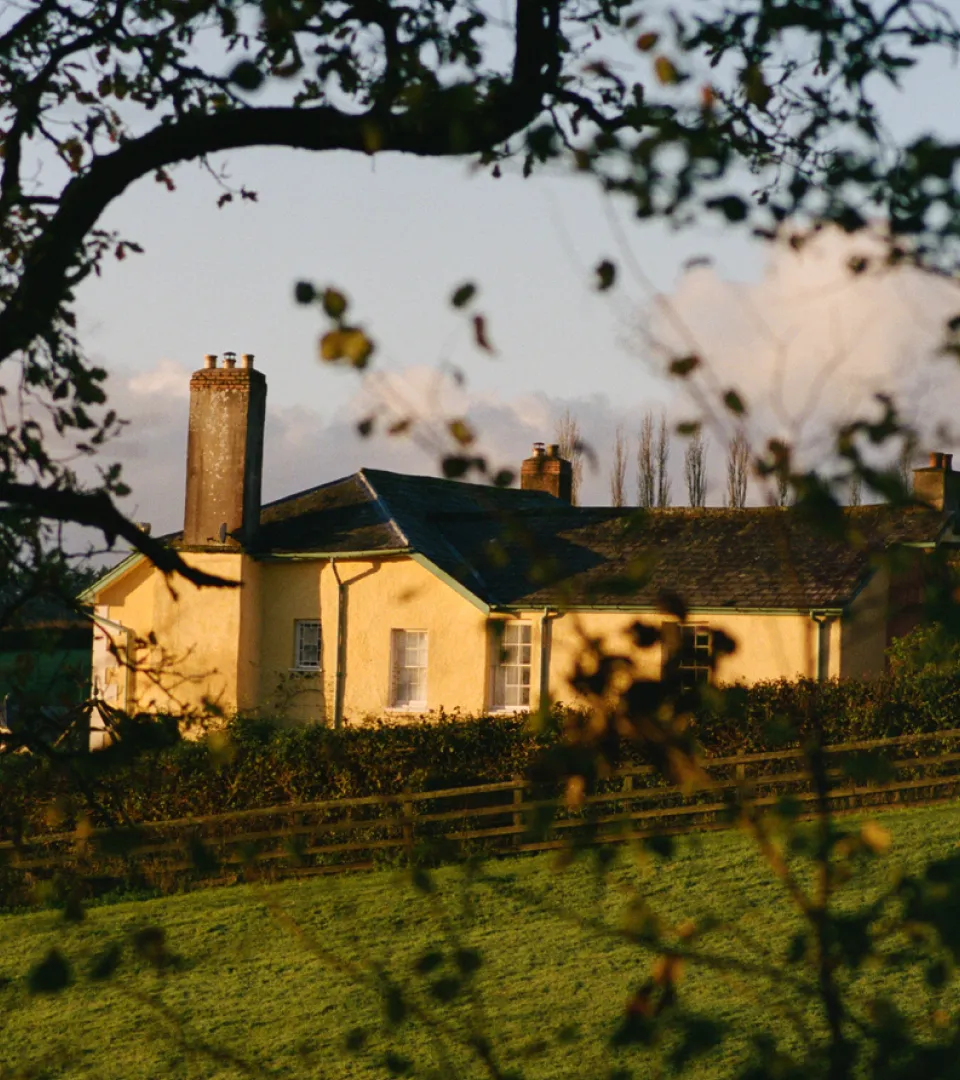
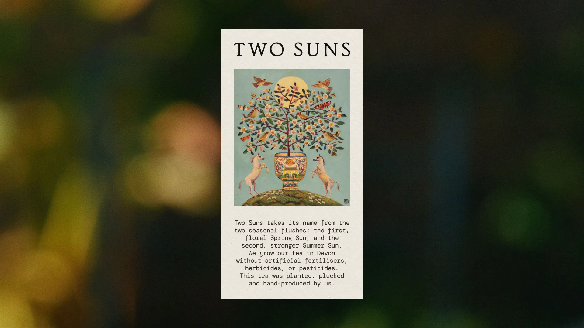
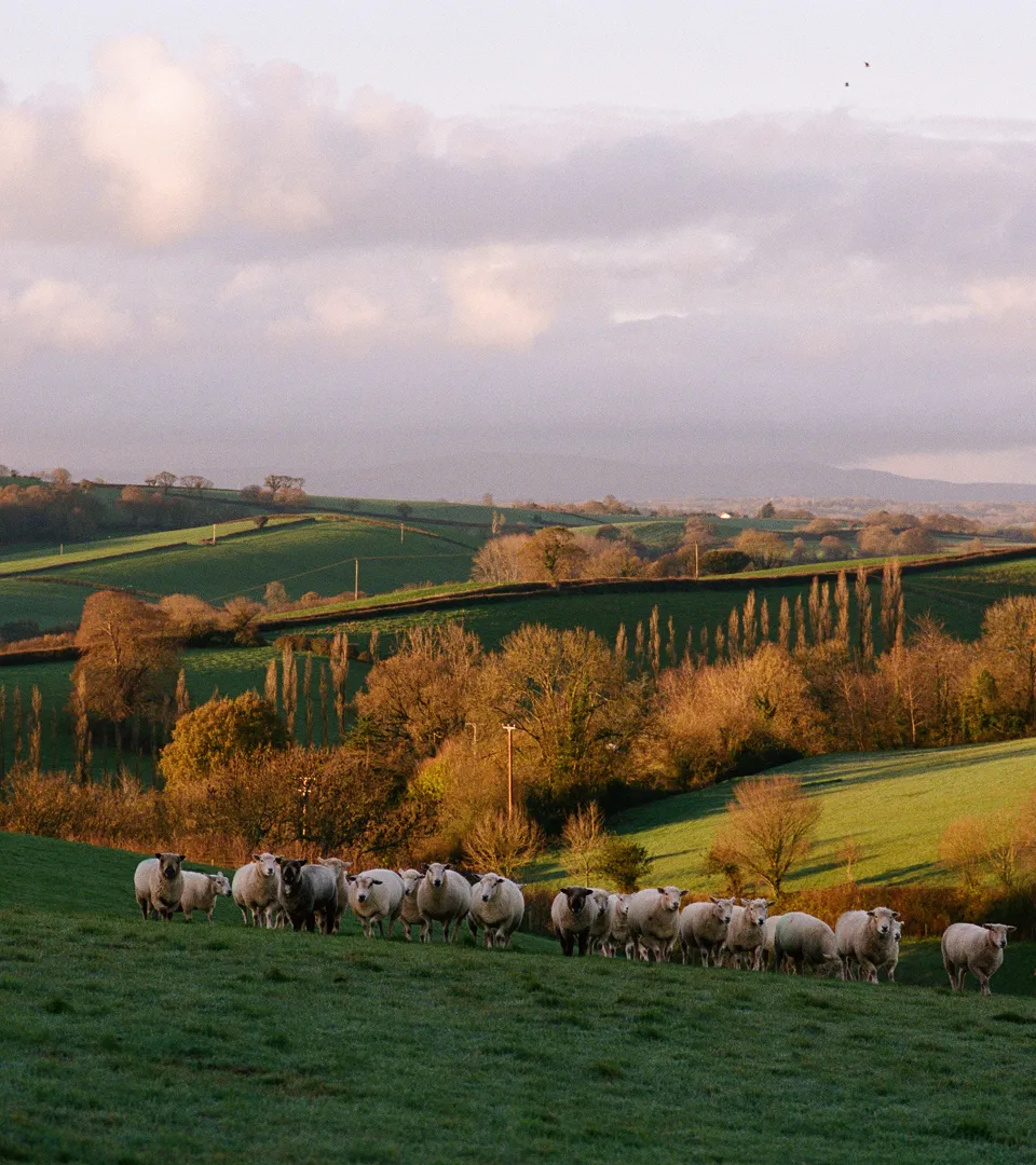
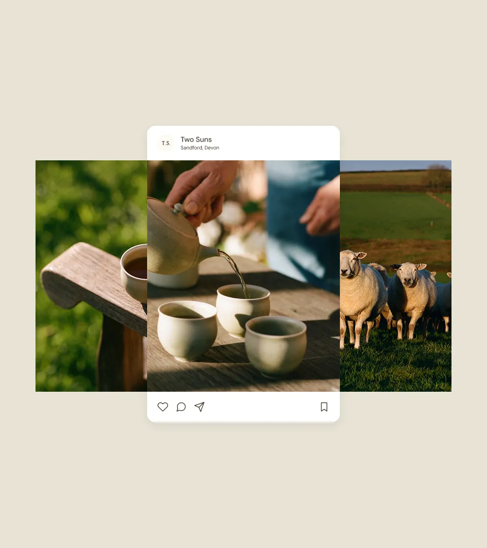
We designed the e-commerce website as an archive of the farm, bringing film photographs of the land, animals and packaging into the experience of choosing tea. The same imagery and colour palette continue on Instagram, where timber, brick, clay and earth provide a setting for the product. Across both, the farm remains present through its materials, textures and everyday life.
Paragraph
Video file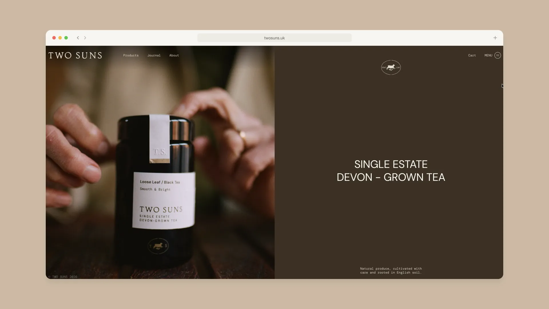
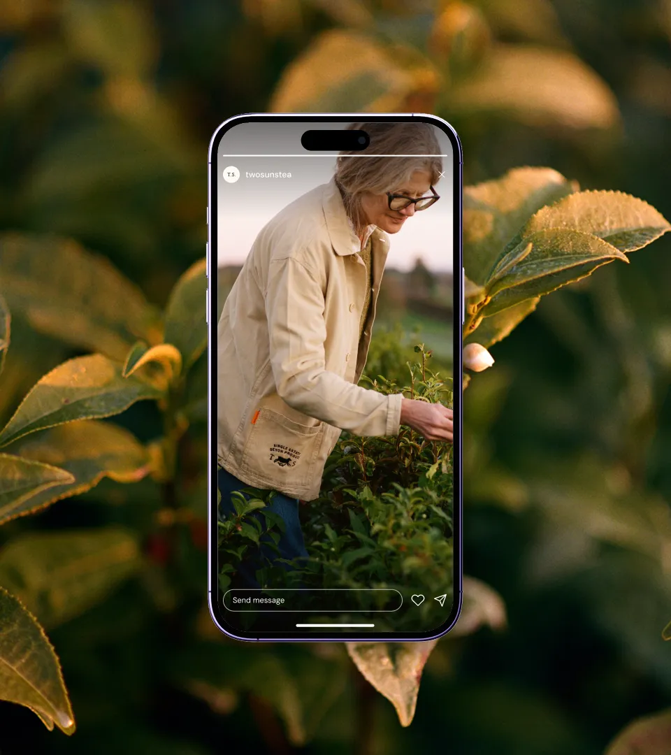
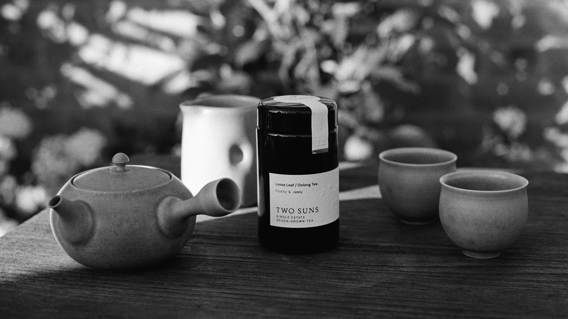
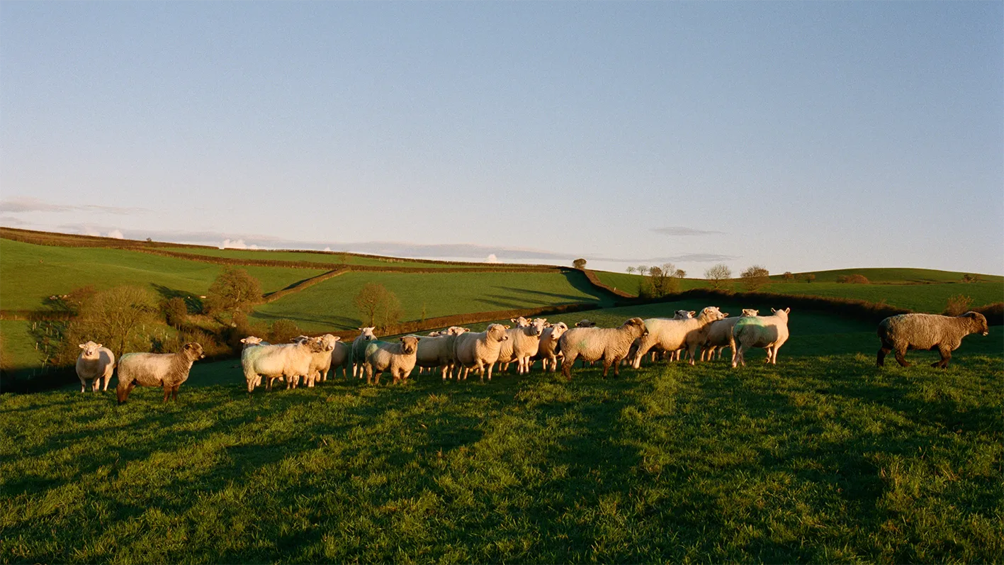
Two Suns grows black and oolong tea on a single acre of a family farm in Sandford, Devon. The surrounding land is sheep pasture, and every leaf is picked and processed by hand. The business grew from the family’s travels through tea-growing regions, including Sri Lanka and Japan, and Alison’s interest in the relationship between soil, plants and their environment. Two Suns is named for the two seasons in which its tea is picked: spring and summer. Each brings a different character to the tea.
We worked with Two Suns from brand strategy and positioning through to its story, tone of voice and visual identity, then carried these into packaging, signage, website design and social media. The farm gave us our starting point: a small place, a patient process and a product whose value lies in the care behind it. We developed a calm, specific voice and an identity that keeps that human care visible.
Material choices were central to the work. We considered the weight and feel of the paper, the cardboard and construction of the handmade boxes, and the amount and placement of gold foil. Wool from the farm’s sheep and a painting by a family friend made the packaging part of the farm’s story. The same attention shaped the photography and digital design, giving people a sense of the place before they taste the tea.
----
Creative Director: Bechara Malak
Brand Designer: Nina Courtney
Senior Designer: Khachig Charshafjian
Photography: Tara Rowse
Painting: Vanessa Cooper
Sign fabrication: Nidderdale Lead
syp
Brand Strategy Visual Identity Verbal Identity Packaging Digital Assets Naming
syp
Next video